How I cut scan triage from 6–8 to 2–3 hours with AI in CoPilot
CoPilot runs a security scanner report through three engines — an RL model, an LLM and an Advice service — and helps analysts quickly separate real vulnerabilities from false positives. I designed the product from brief to developer handoff.
- Role
- Worked through analyst workflows with analysts and the PM. Designed AI check setup, processing status and finding review, including states, errors and expert actions; handed the design off to developers.
- Team
- 9 people: me (designer), PM, analyst, 2 frontend, 2 backend, 2 QA
- Product
- AppSec Solutions, cybersecurity, B2B SaaS, web
- Outcome
- ≈ −60% time to triage a large scan (from 6–8 to 2–3 hours); ≈ 2 in 3 findings closed without opening the code
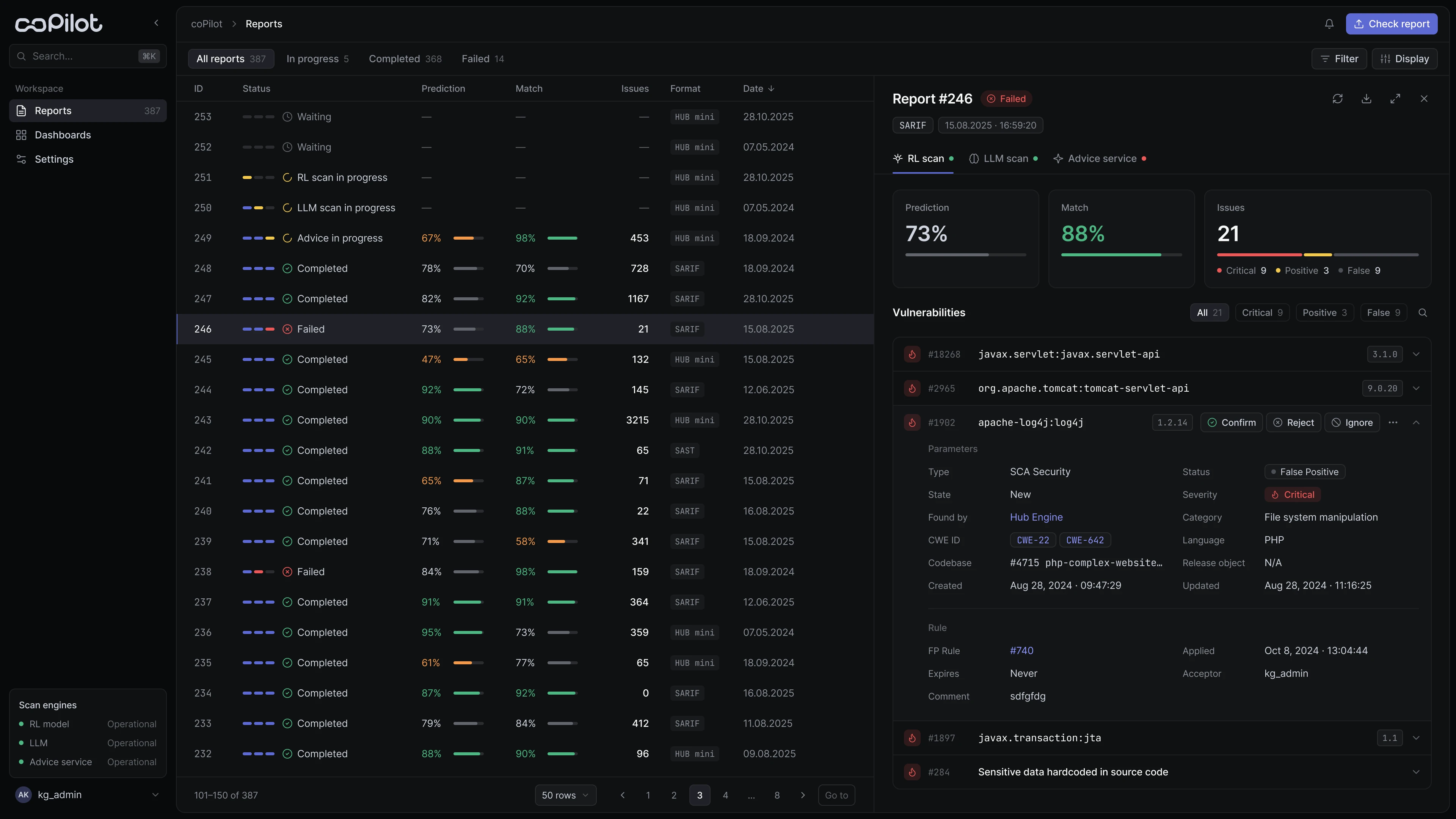
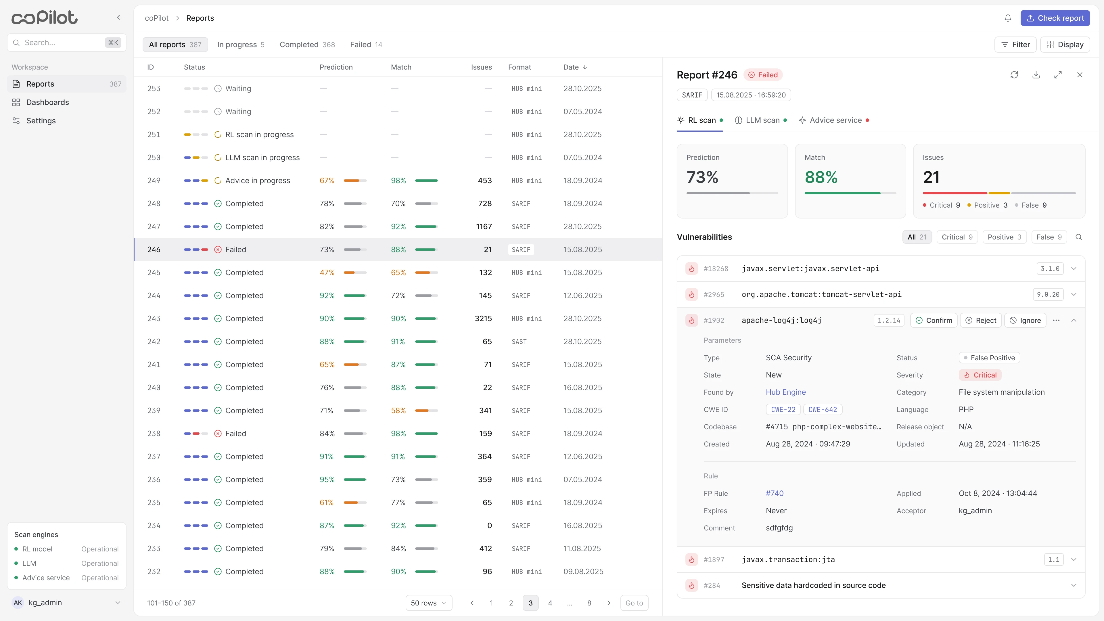 Light
Dark
Context
After every scan an analyst received hundreds of findings, and triaging a single scan took 6–8 hours.
AI could speed this up, but only if the interface answers three questions at any moment:
Research
I held regular calls with analysts and walked through scenarios with the PM. Key findings:
- No status, no trust. An expert needs to see which stage a check is at and where it failed.
- A prediction is easy to mistake for a verdict. The AI's assessment and the human decision must be clearly separated.
- Hundreds of findings, limited expert time. The evidence for a decision has to live in one place.
Key decisions
Several signals, not one badge. Prediction, Match and each engine's results are shown separately, so the analyst checks the logic instead of taking the conclusion on faith. Any disagreement between signals is visible at once.
A choice of check depth, not always a full analysis. Fast triage and deep review are different jobs, so before starting a check the analyst can run the full pipeline or individual engines.
A human makes the final call, not an auto-close threshold. Auto-closing can't be defended in an audit, and a single false negative means a missed real vulnerability.
Mapping the workflow
The flow is split into two modes: monitoring and reviewing.
01Control before the check starts
Everything that affects the result sits in one dialog: report format, the report itself and check depth — from the full pipeline (RL → LLM → Advice) to individual engines. Each mode has a short explanation, so the choice is clear without documentation.
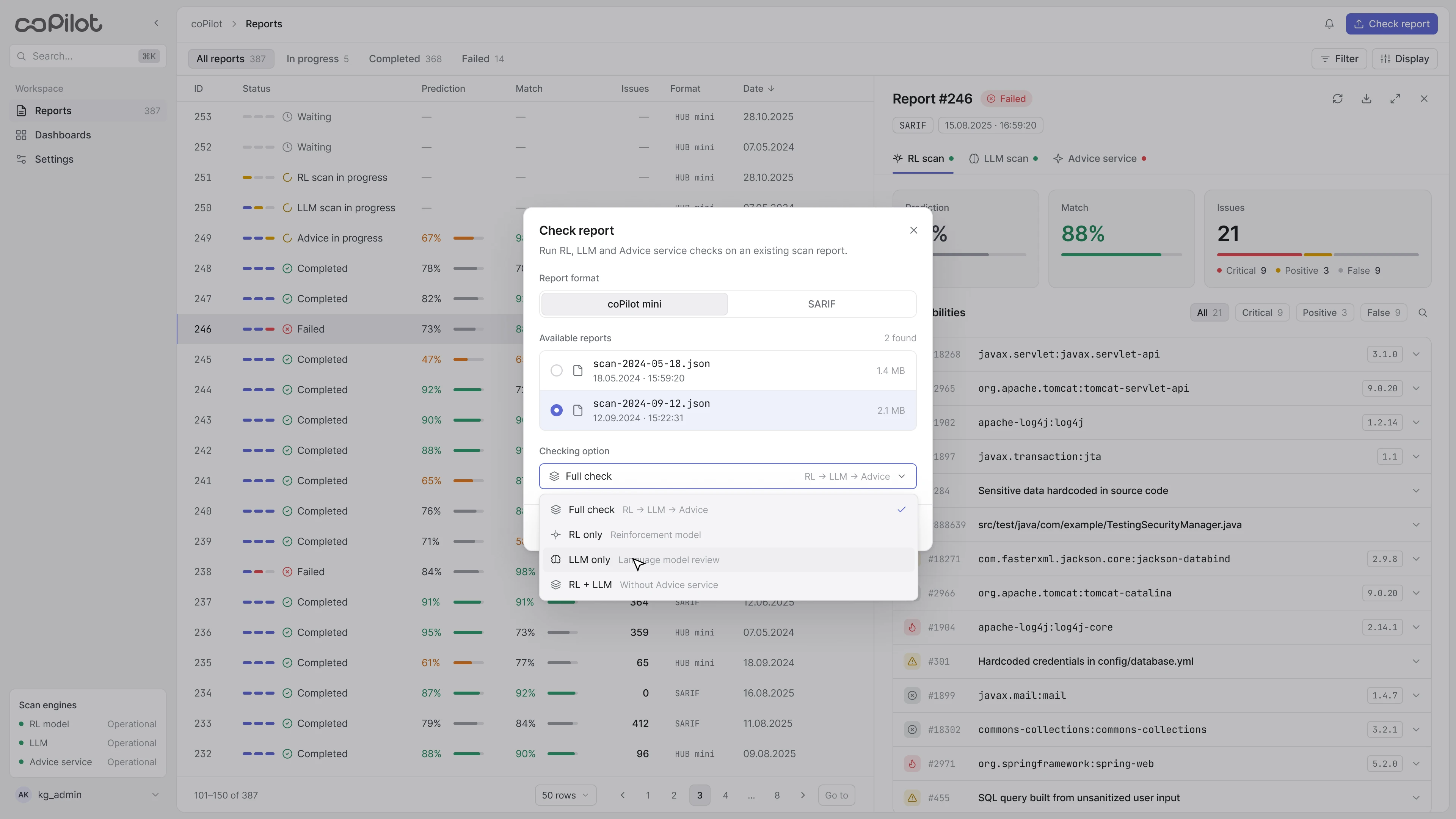
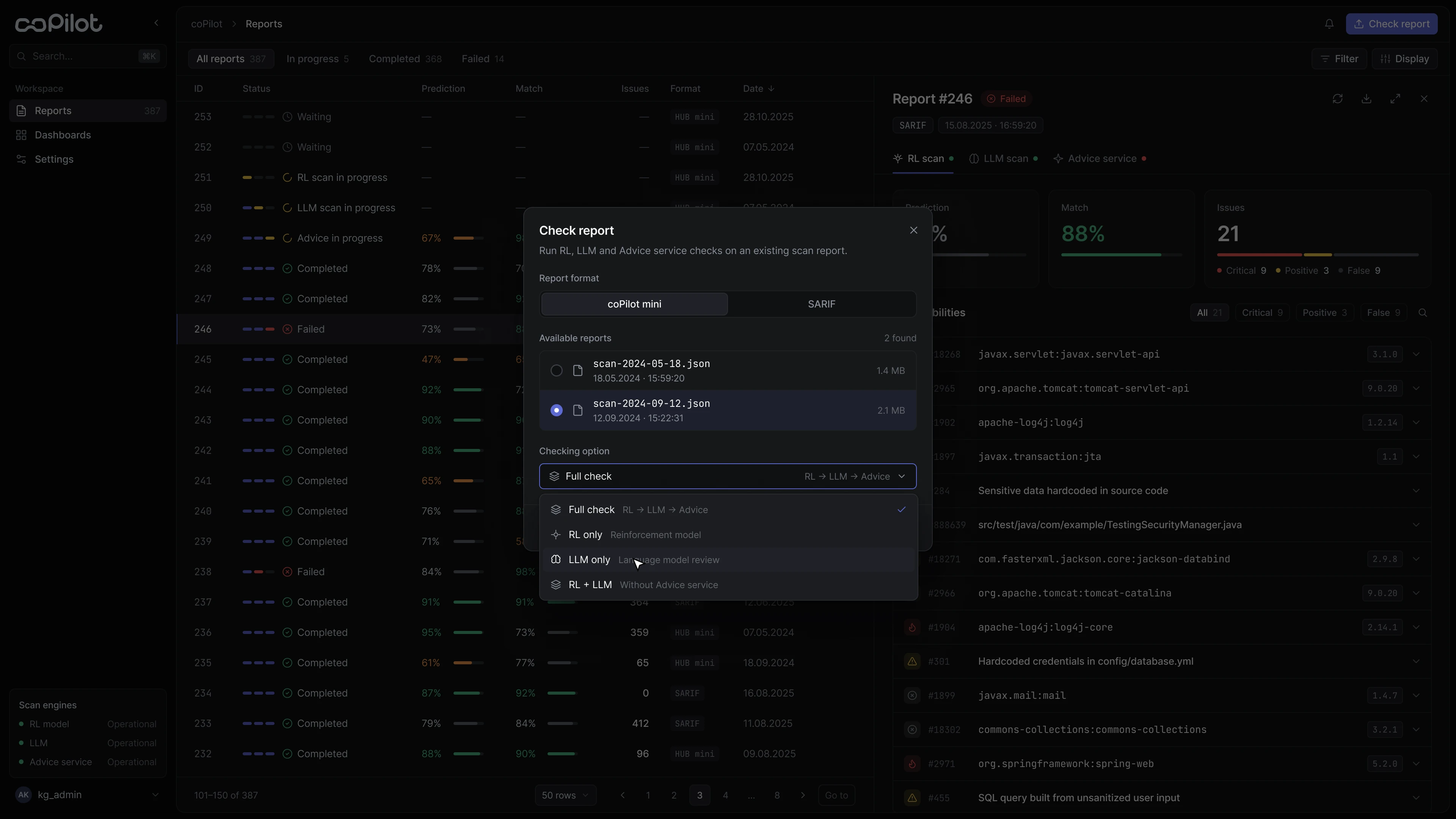
02Making background processing visible
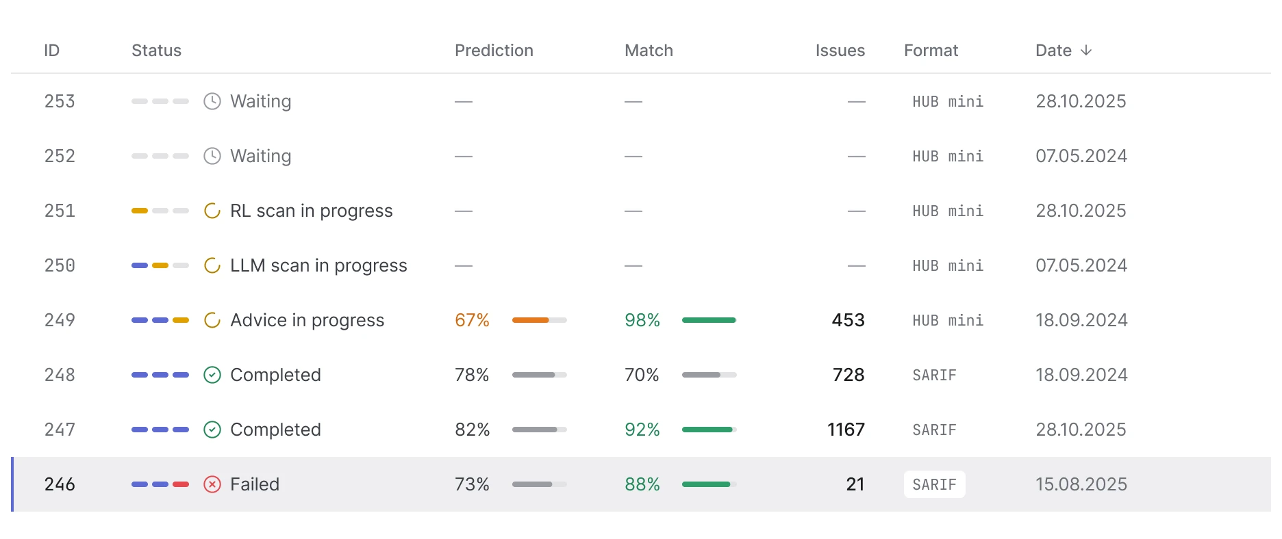
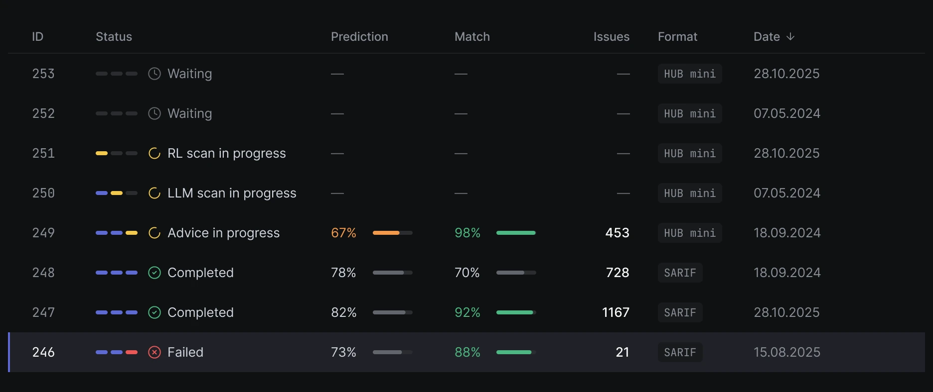
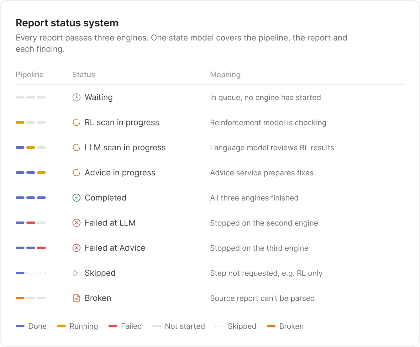
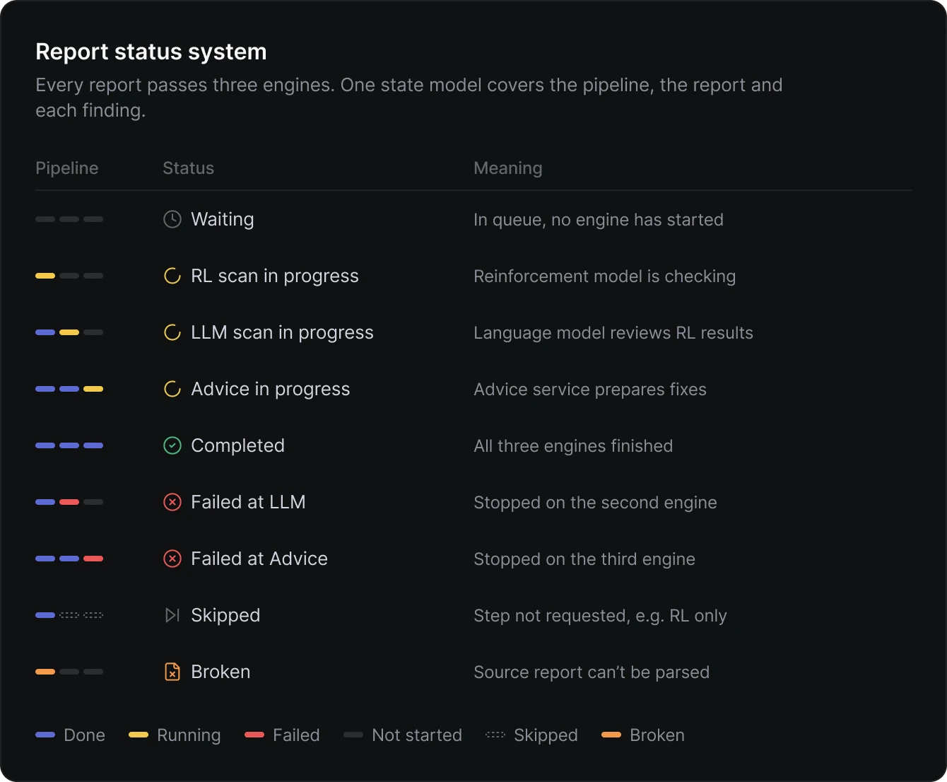
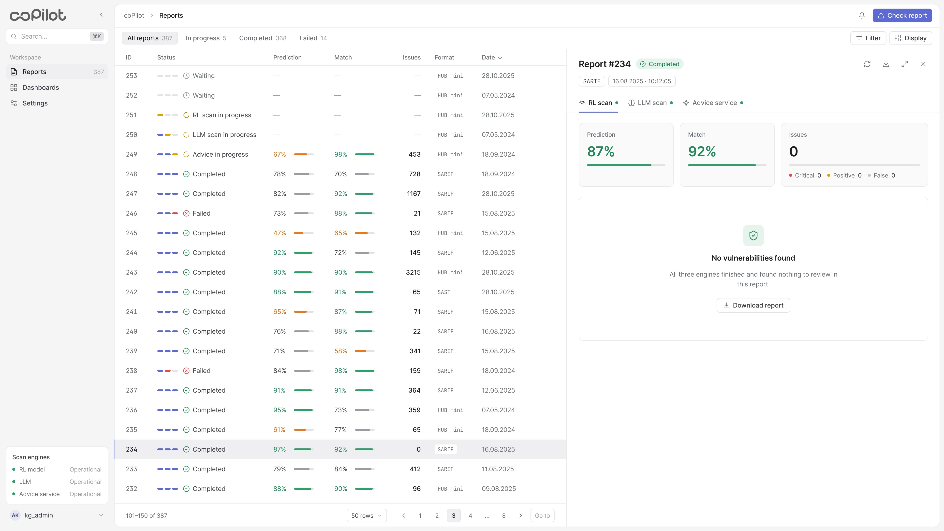
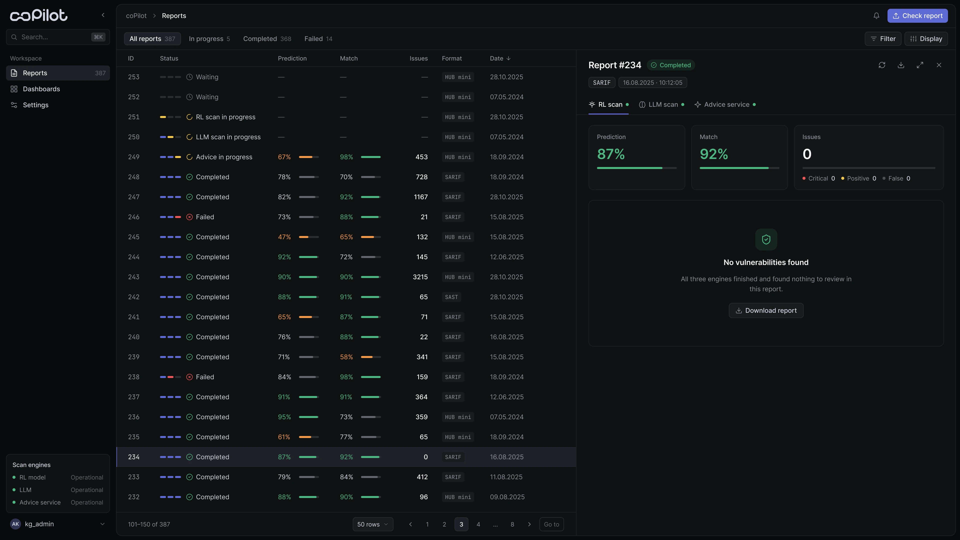
Instead of a generic progress bar, each report has three segments — one per engine. At a glance the analyst sees where the check is, what is done and where it stopped, and knows whether to wait or step in.
Waiting · In progress · Completed · Skipped · Failed · Broken
03From a result to an investigation
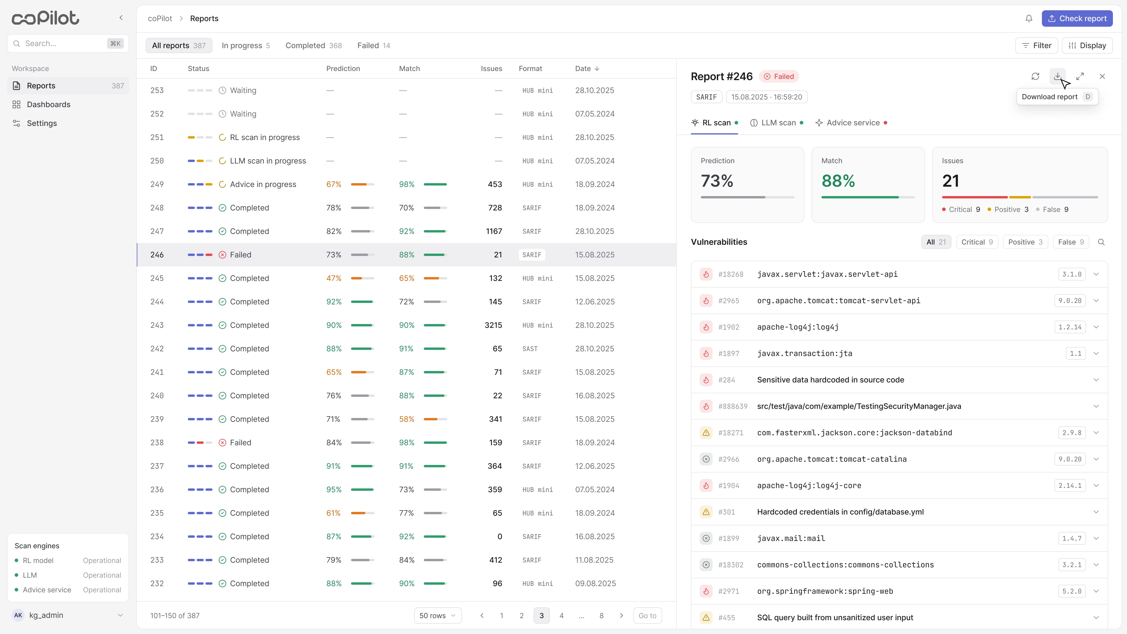
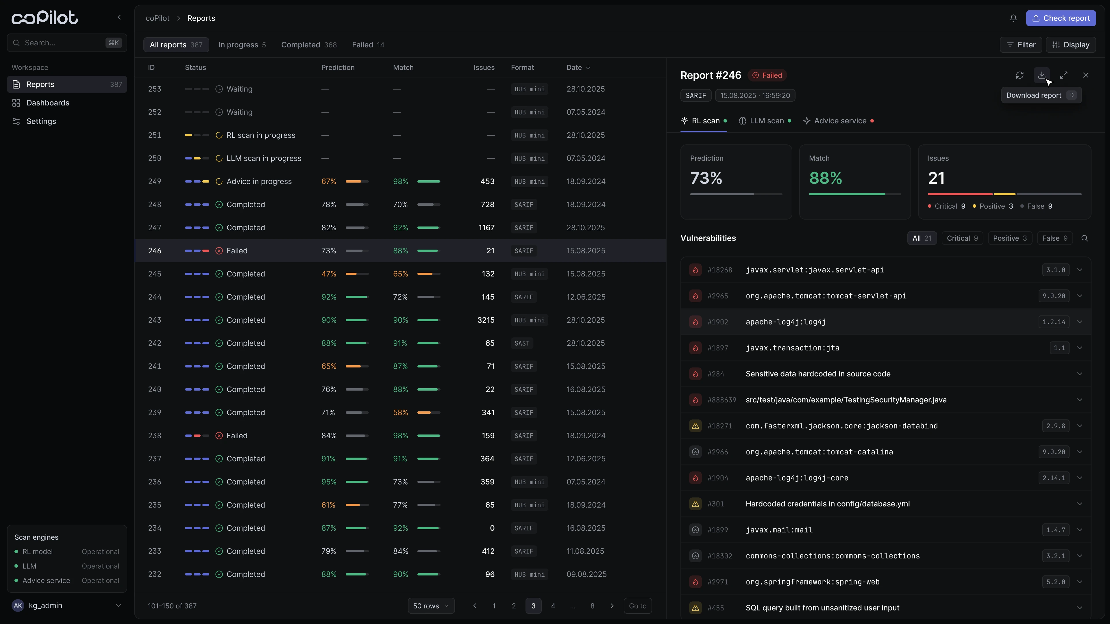
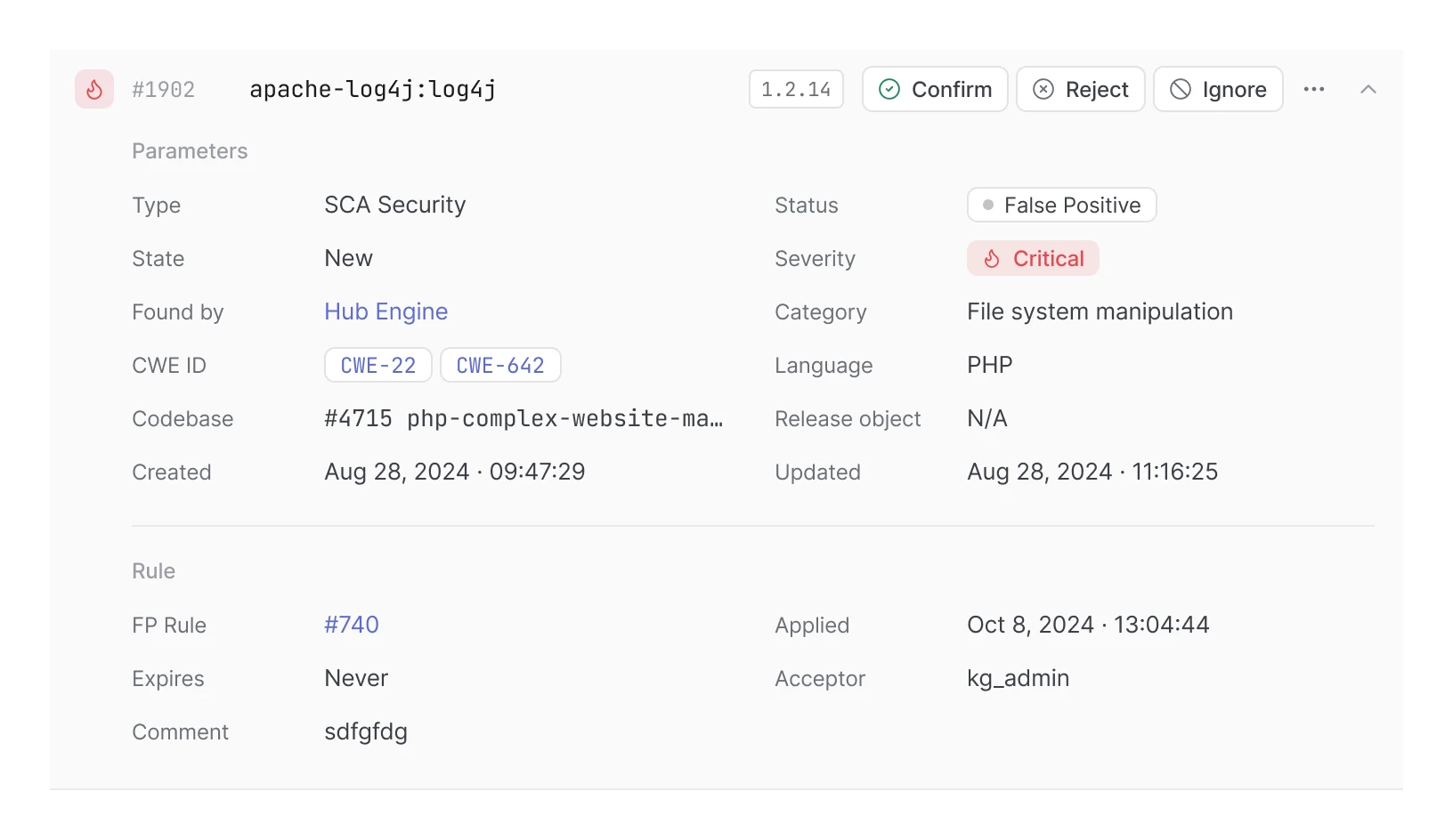
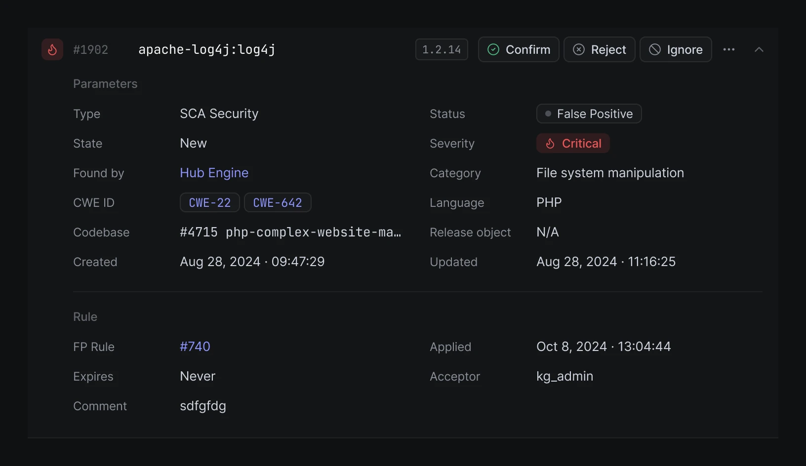
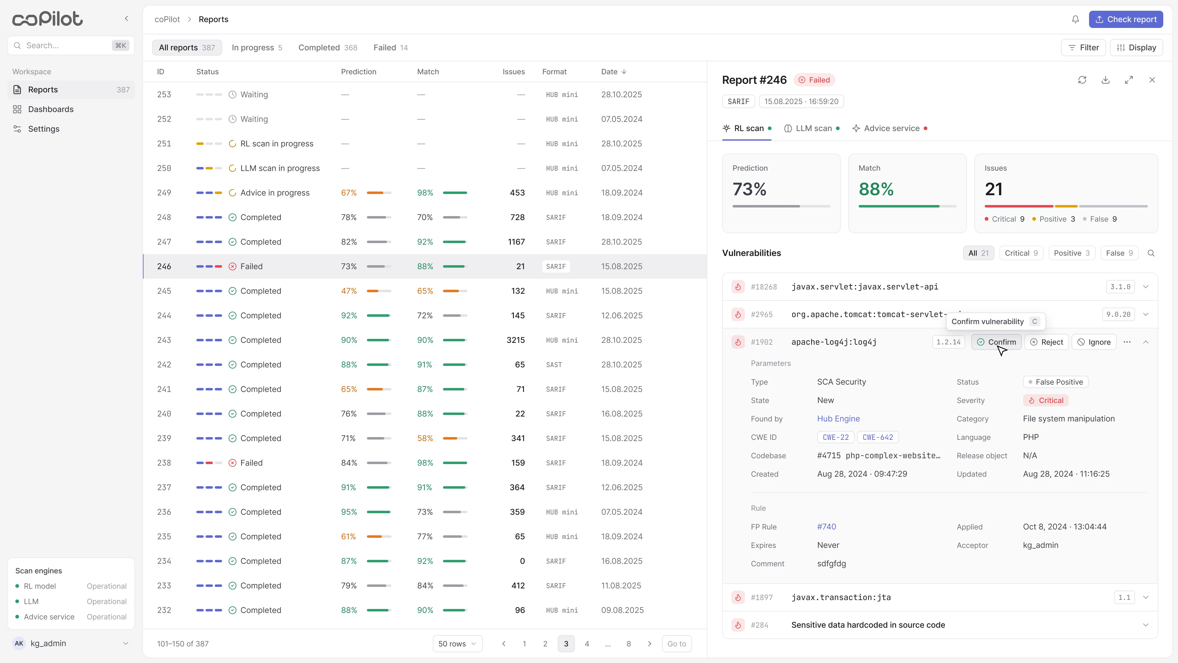
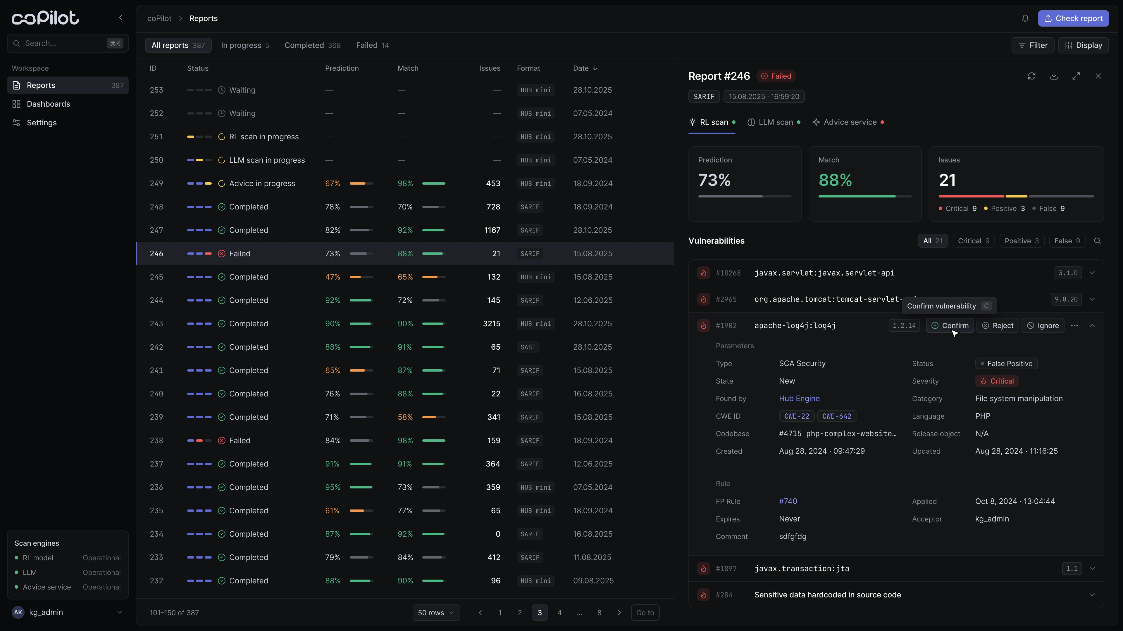
The report opens next to the list, so the analyst keeps the context. The panel follows a clear hierarchy:
- check summary: Prediction, Match and findings by type
- the finding and its technical parameters
- review status and the rule behind the decision
- the expert's next action
04Keeping the human in the loop
Only an expert can confirm, reject or ignore a finding, and every decision is recorded in the history. Actions are labelled with words instead of hidden behind icons: a decision that has to be defended in an audit shouldn't involve guessing.
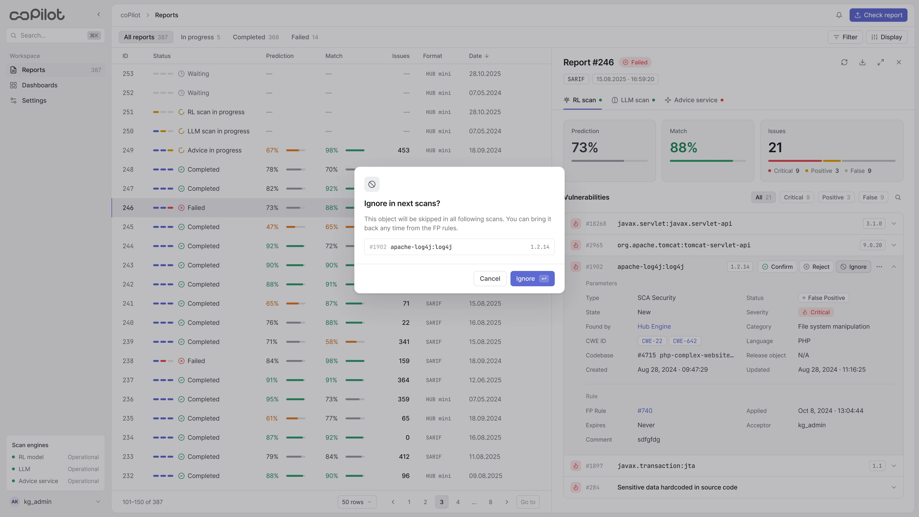
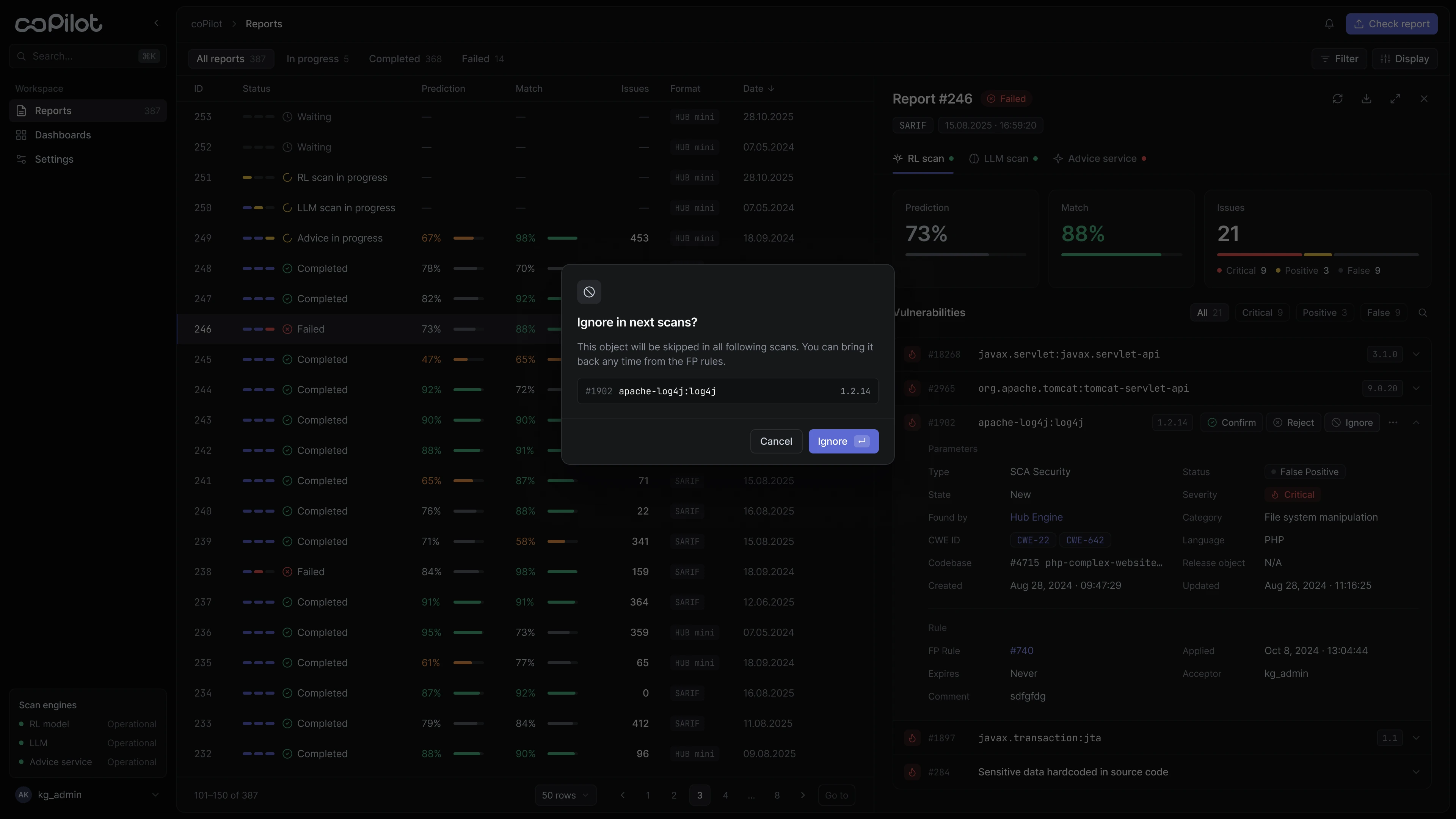
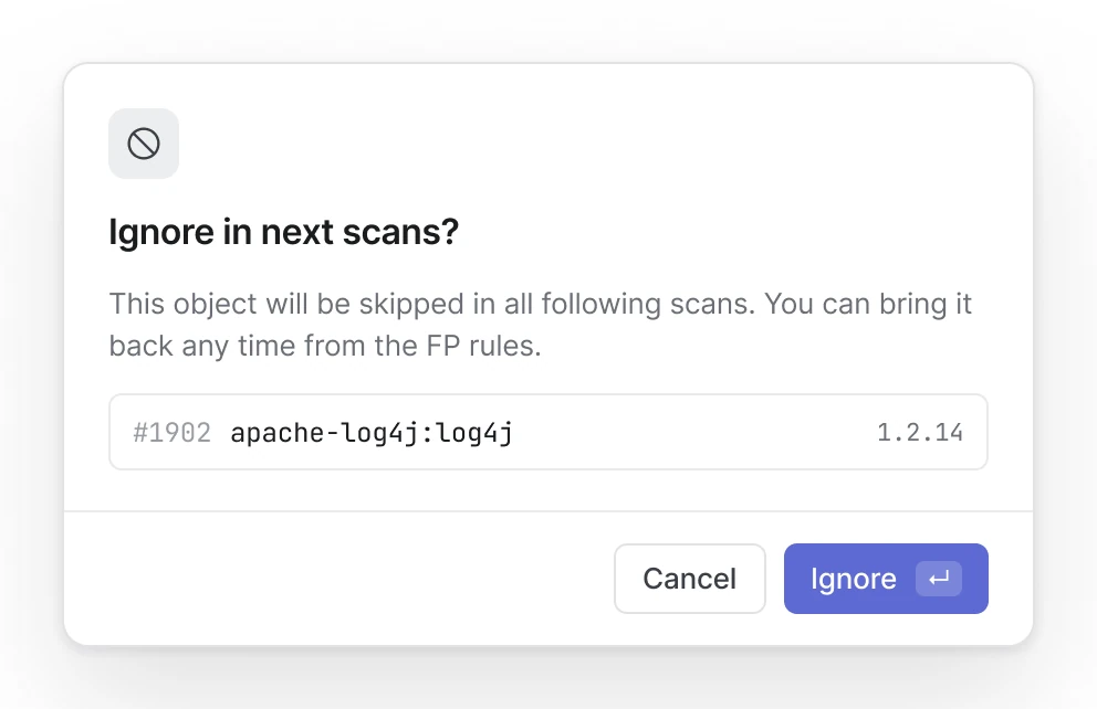
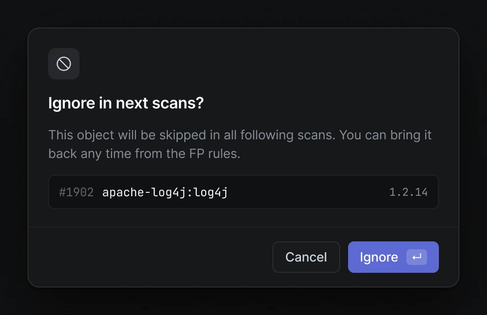
05Actions with consequences for future scans
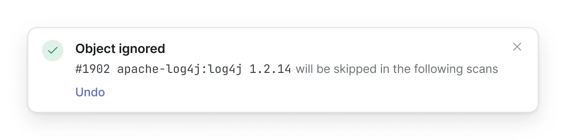
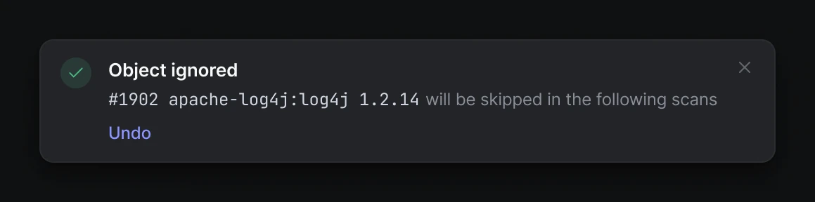
Ignore excludes an object from later scans, so it is more than a dismiss: the consequence is shown before confirmation, and afterwards the product confirms that the rule will apply going forward.
06A failure is not a dead end
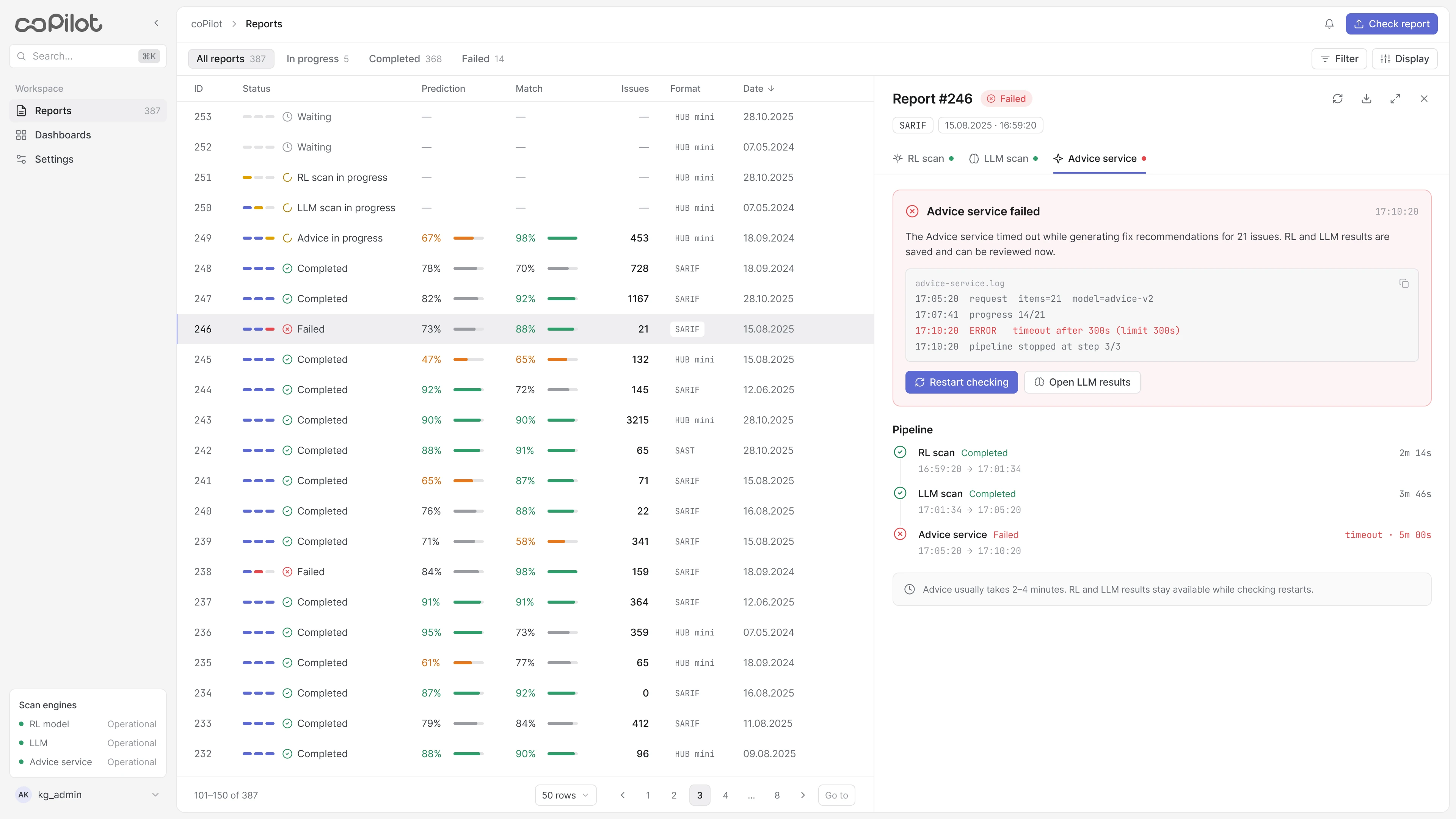
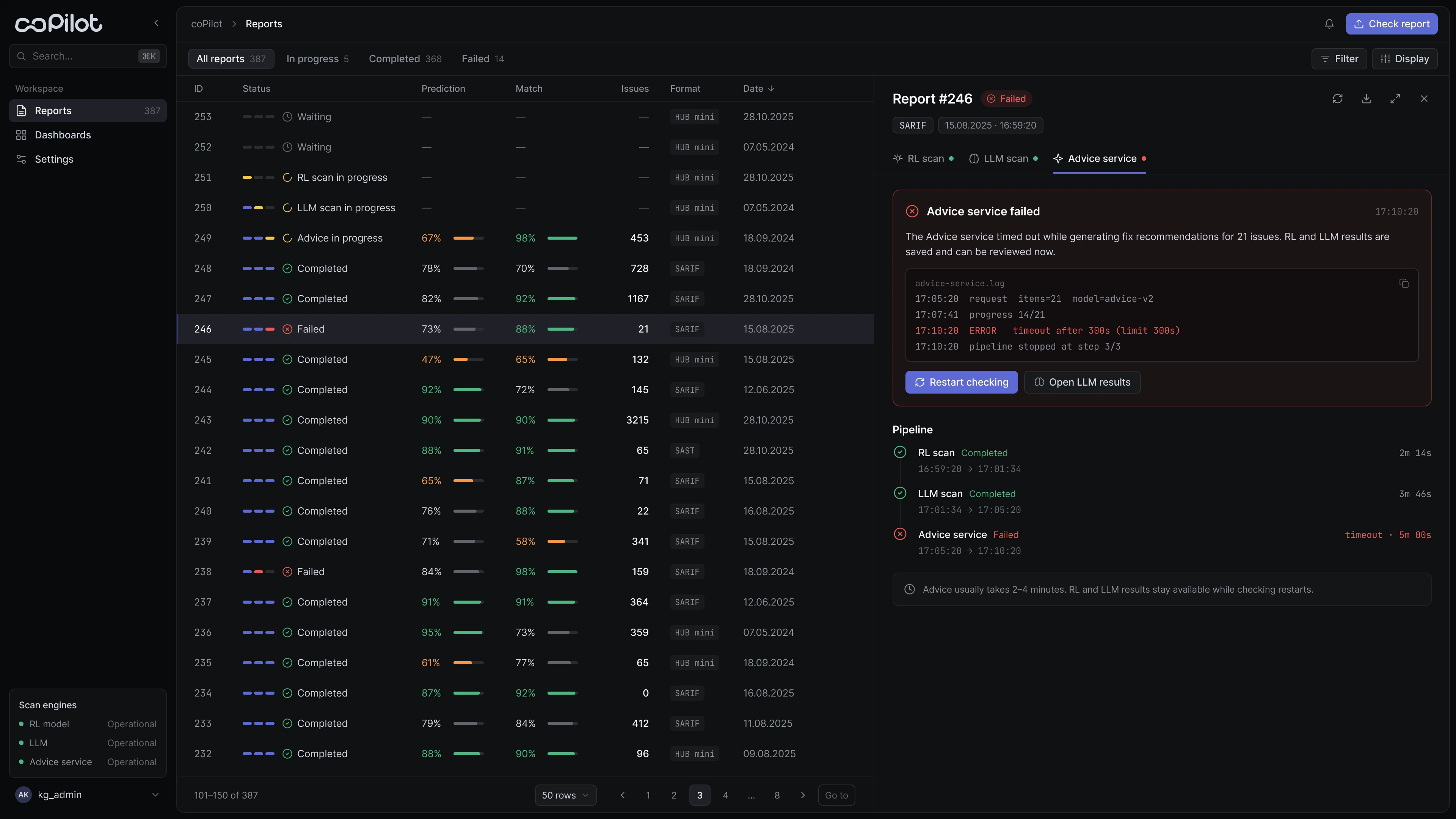
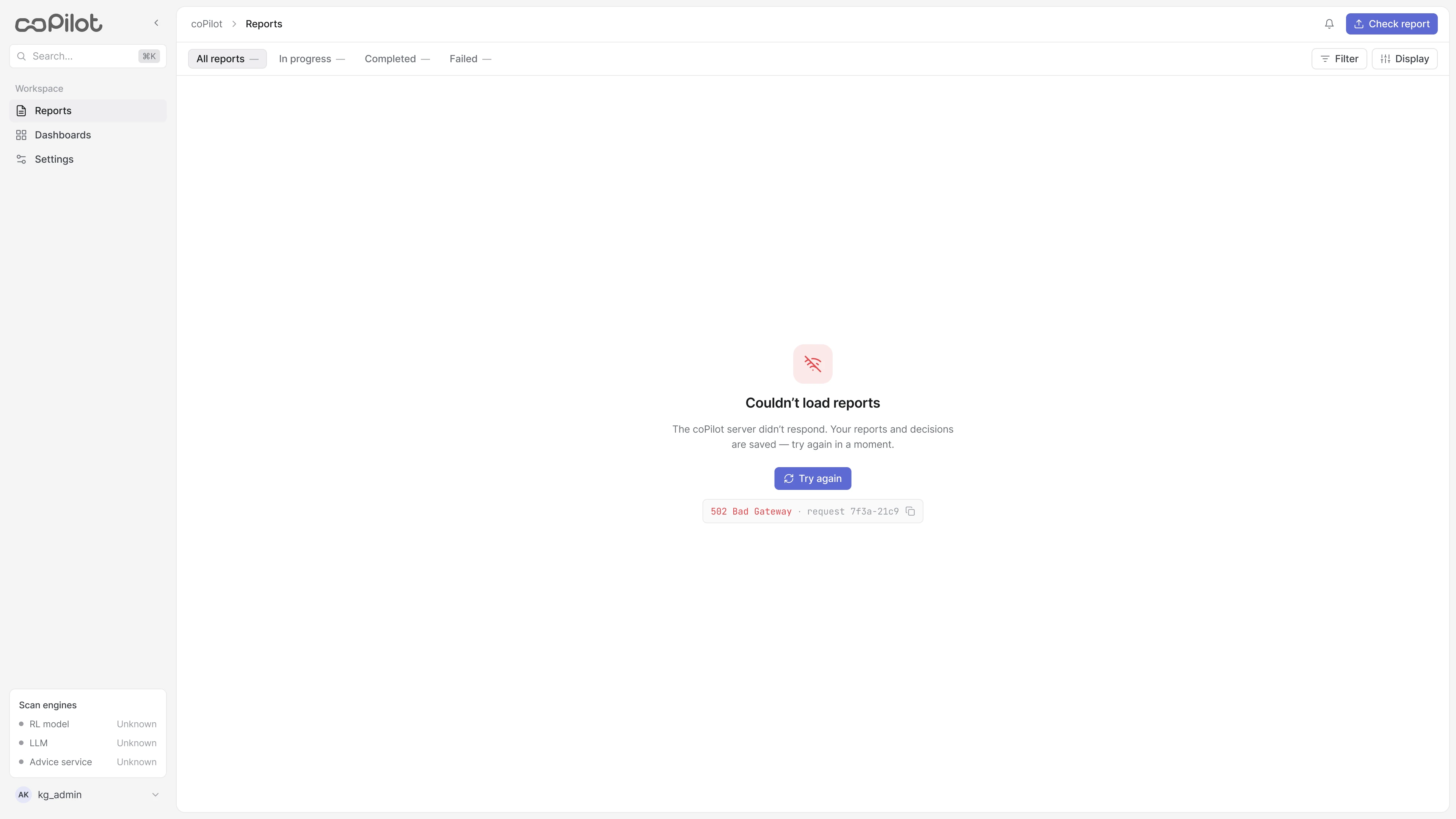
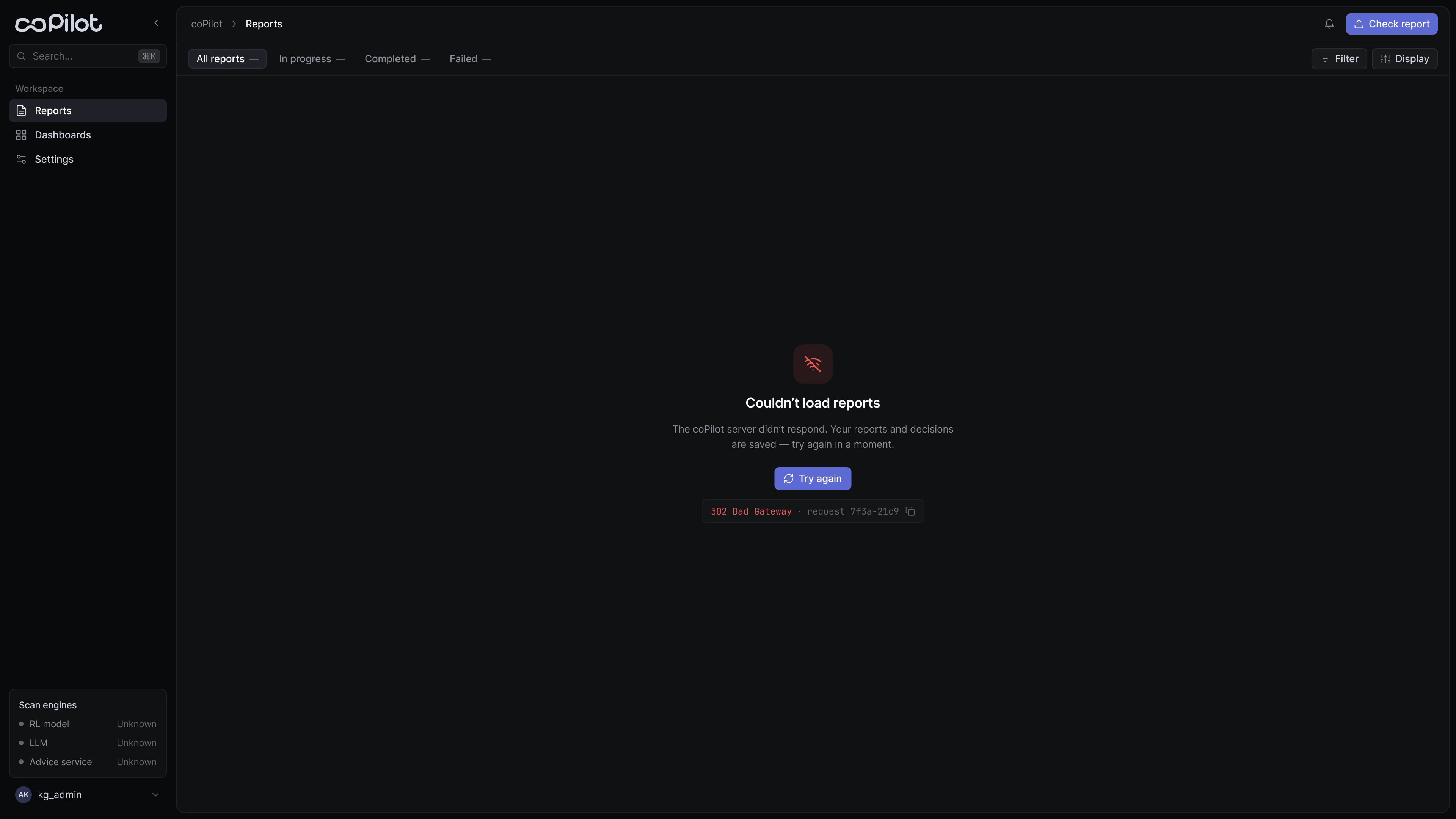
If one of the engines fails, the analyst sees at which stage, why, and what is already done. RL and LLM results stay available, and the check can be restarted right from the error card.
Beyond the happy path
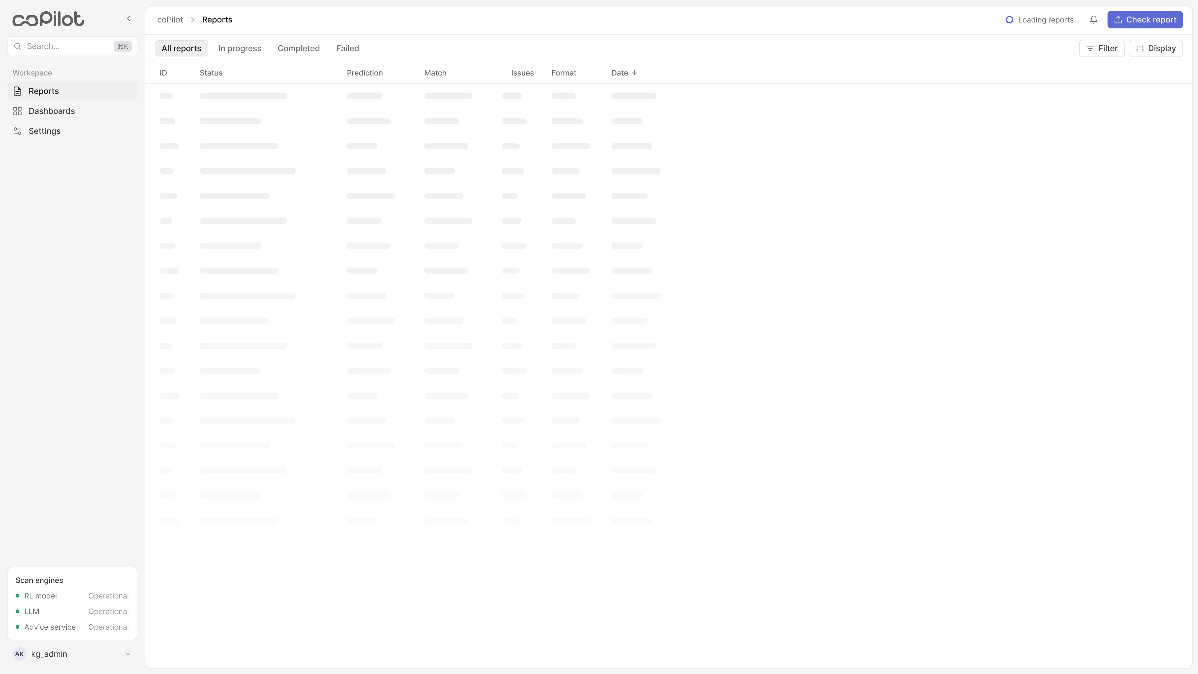
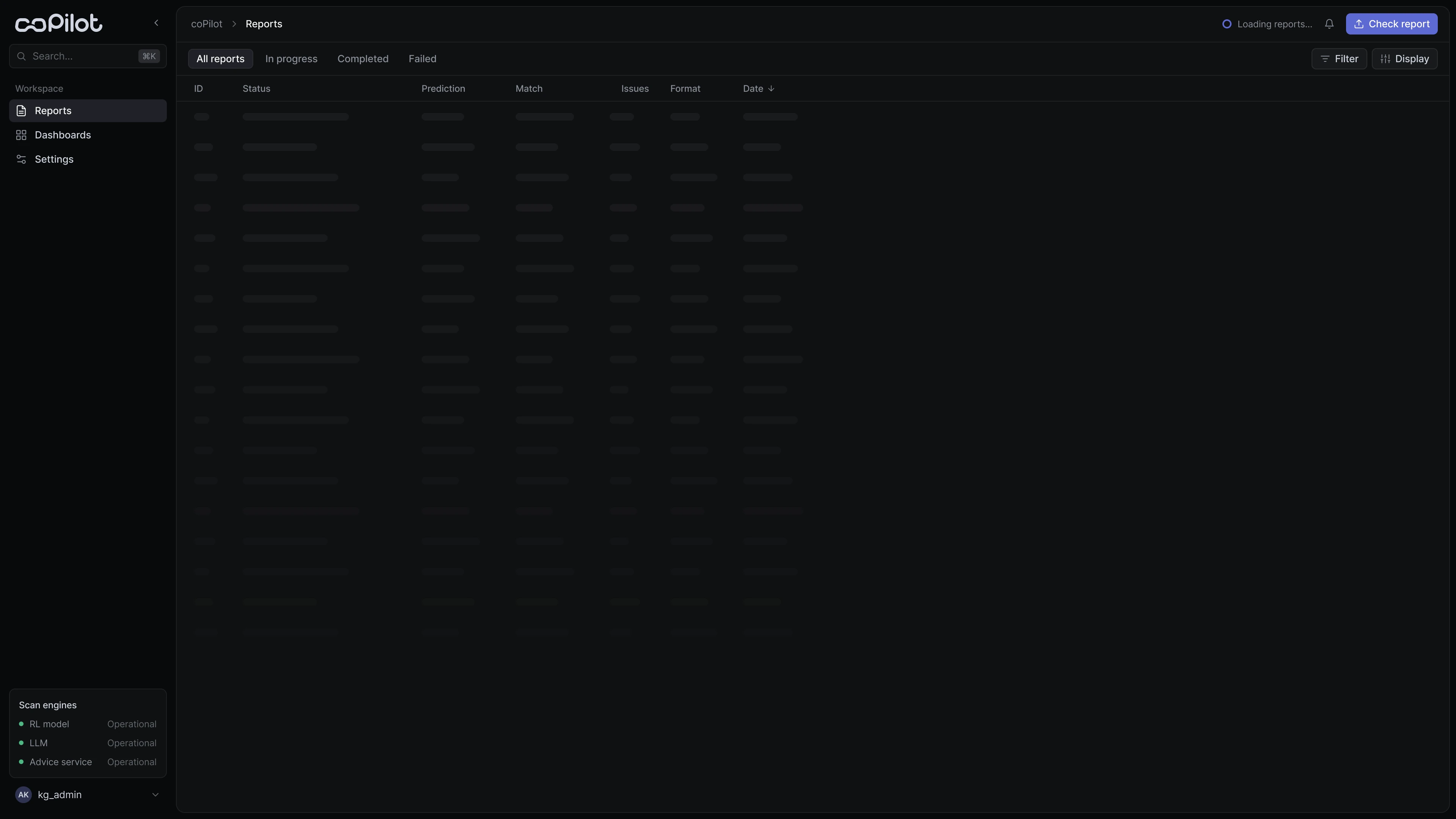
I defined 8 states — from waiting and in progress to failed, empty and zero findings — and reused the same logic at every level: the pipeline, the report and an individual finding. Complexity grows without new rules for every screen.
Light and dark themes
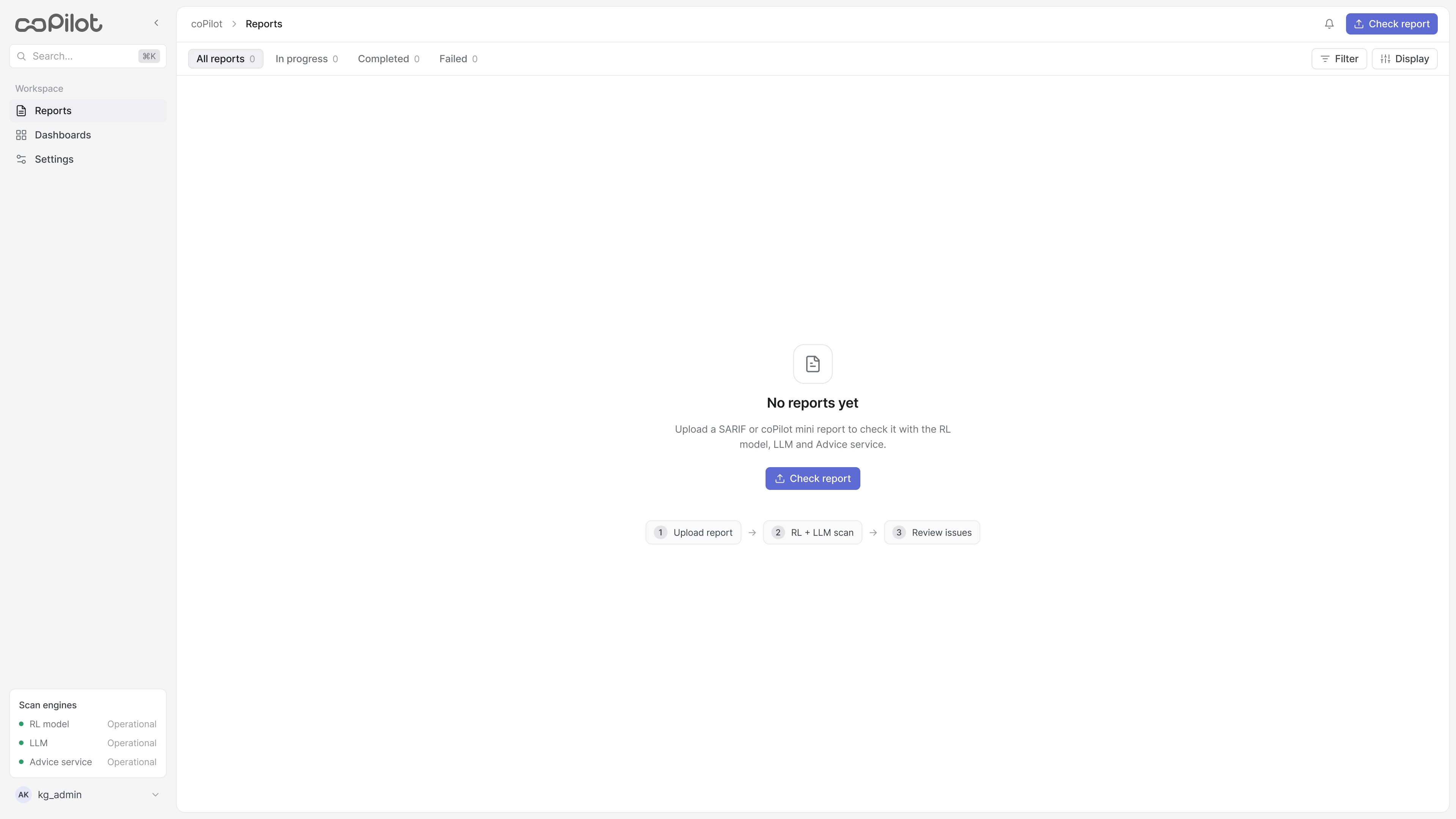
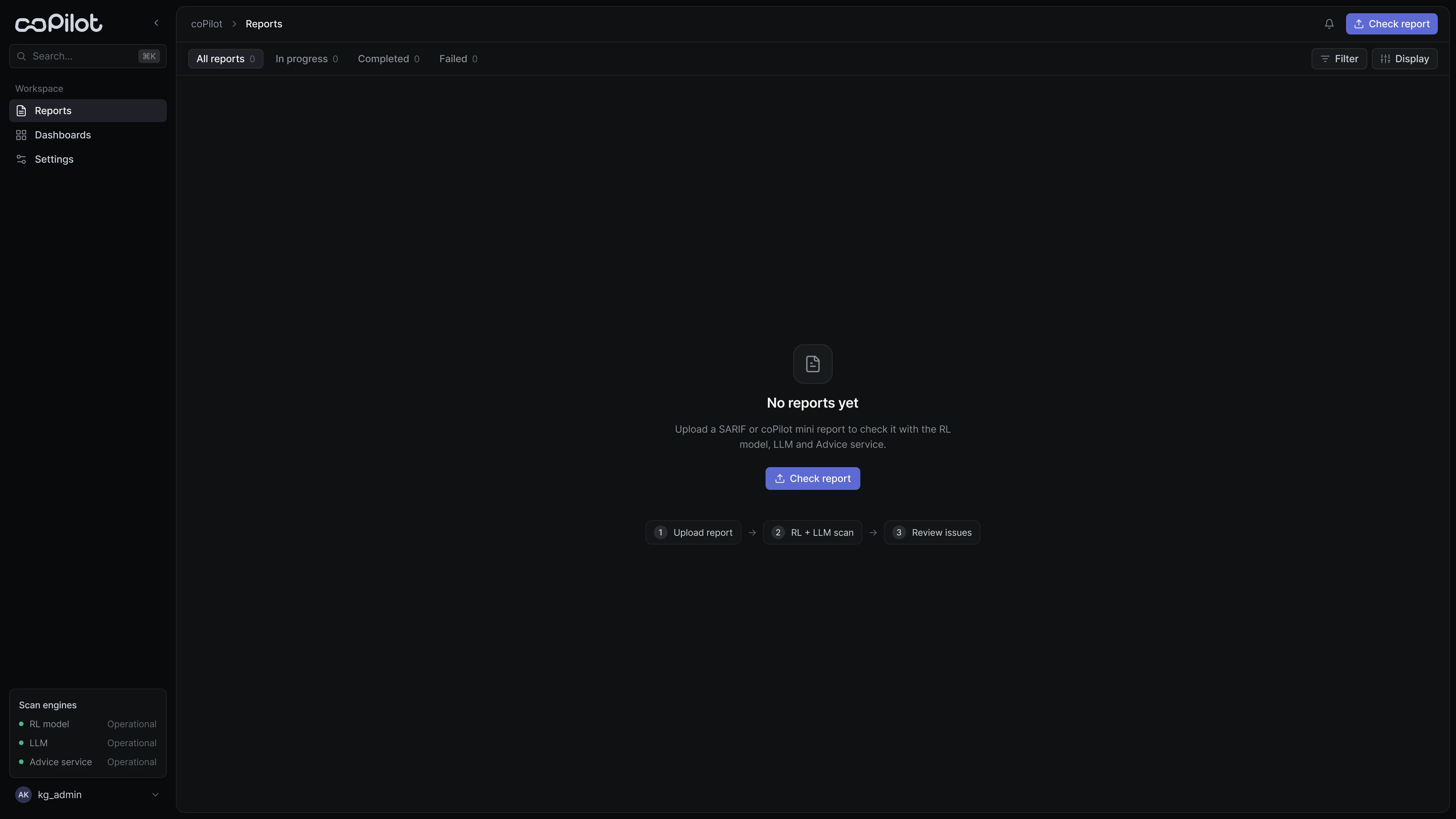
The interface is built on semantic tokens — background, surface, border, text, accent and status colours. Both themes come from one system: only colour values change, not the layouts. Status colours are darker in the light theme to stay legible on white.
Outcome
- ≈ −60% time to triage a large scan: from 6–8 to 2–3 hours.
- ≈ 2 in 3 findings closed without opening the code: obvious cases are resolved straight from the check results.
- 100% of decisions are traceable: the triage can be defended in an audit.
- A single system of 8 states: one specification for development instead of mockups for every case.
What I learned
Complexity doesn't disappear when you simplify an interface — it has to be structured. Triage got faster not because AI decides for people, but because the analyst can see what each conclusion is based on.