How I guided new players through identity checks and a first deposit without losing the game they chose
I designed sign-up and the first deposit for a UK iGaming product. The goal was to get players through the required checks without losing sight of why they came: to play the game they chose.
- Role
- Worked through requirements and constraints with the PM and analyst. Designed the flow from sign-up and identity checks to the first deposit and game launch, including errors and resuming progress; prepared a testable prototype and designs for development.
- Team
- 6 people: me (designer), PM, analyst, 2 iOS developers, QA
- Product
- iGaming, mobile app, UK market, NDA
- Result
- An end-to-end flow from sign-up to launching the chosen game: 6 steps and 11 edge cases; handed off to development. Metrics are under NDA
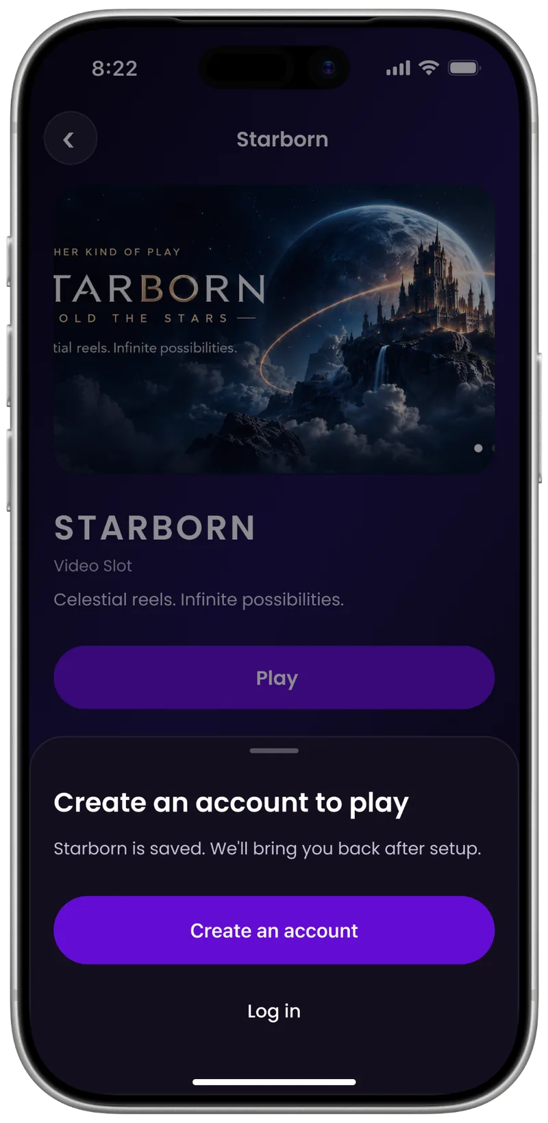

The chosen game stays with the player from tapping Play to launch.
Context
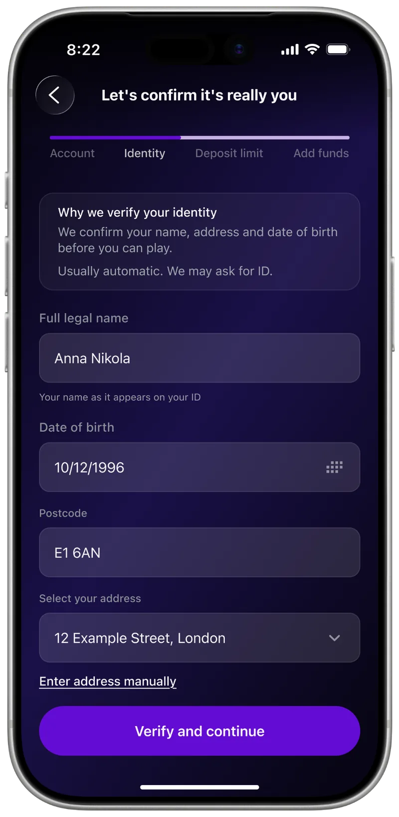
In the UK, a player can’t just sign up and play: the law requires identity verification, deposit limits and player-protection rules. Every one of those steps is a point where a new user might drop off.
The challenge was to guide players through these steps without it feeling like a compliance funnel.
Research
- Requirements from the PM and analyst. We worked through scenarios and product constraints together.
- UK market rules. Identity checks, deposit limits and player protection defined the required steps.
- Competitor review. I looked at how other UK iGaming apps handle sign-up and identity checks.
- Clickable prototype test. We checked whether people could get from the chosen game to launch.
Key decisions
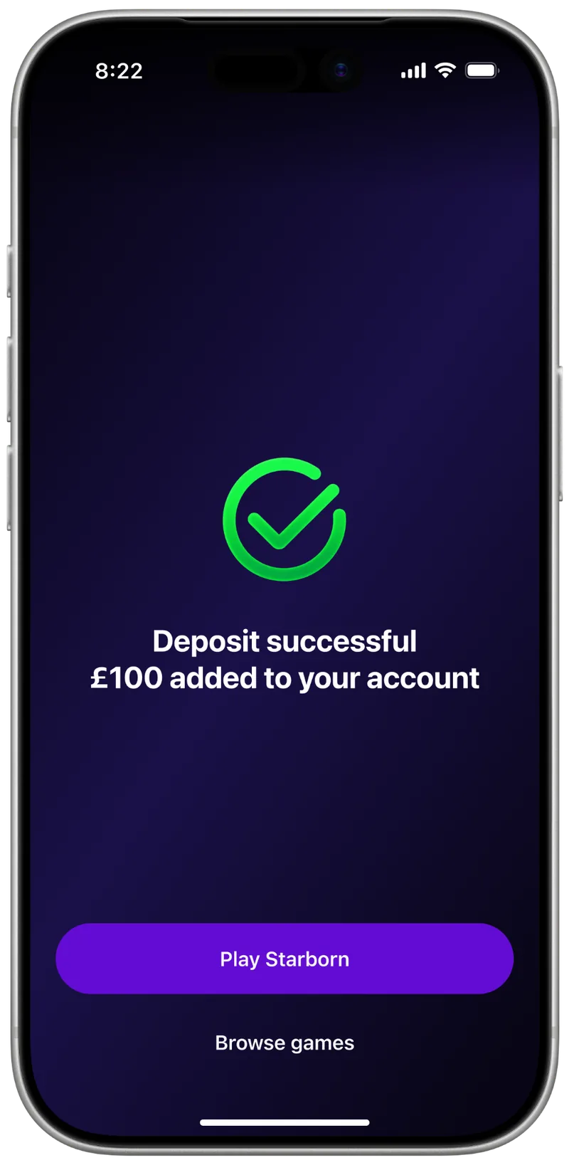
The chosen game throughout, not a separate sign-up funnel. Players always see why they’re going through the checks, and after the deposit they land straight in the game.
Saved progress, not sign-up in one go. If someone leaves, they pick up where they left off.
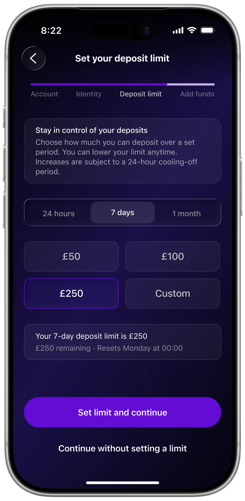
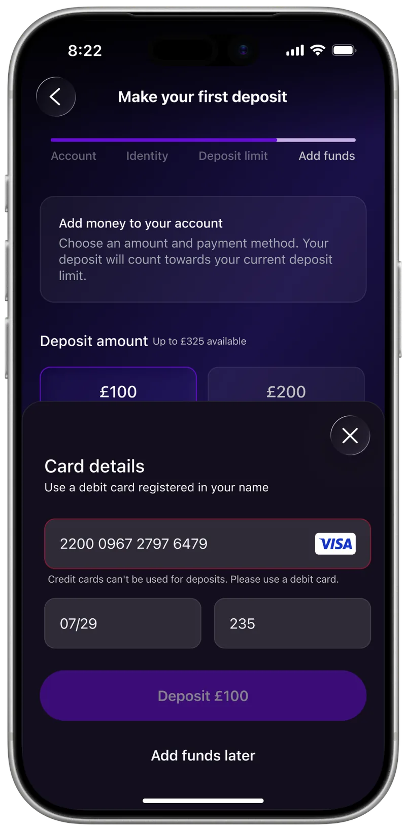
Optional deposit, not a required step. Players can finish sign-up without adding money.
The core journey
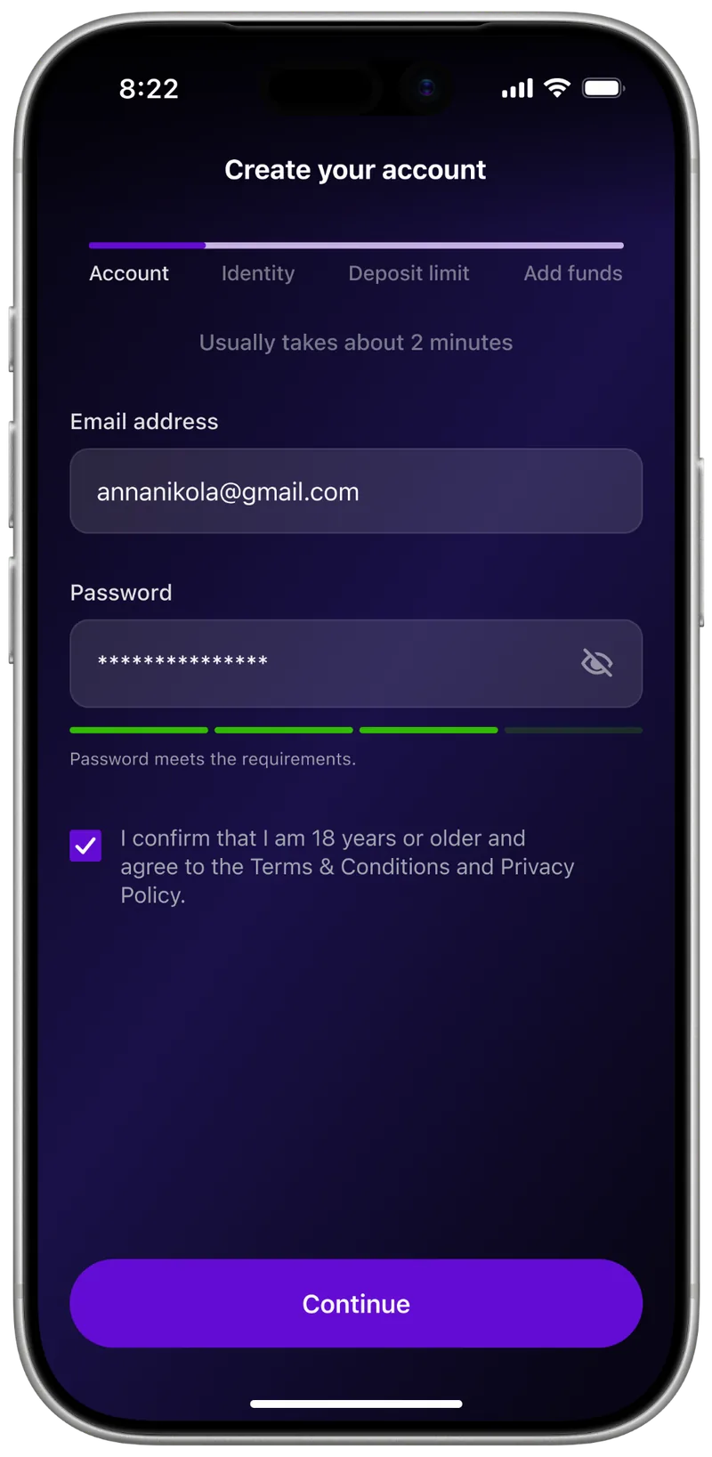
I built the shortest successful path first, then added errors, waiting and leaving mid-flow.
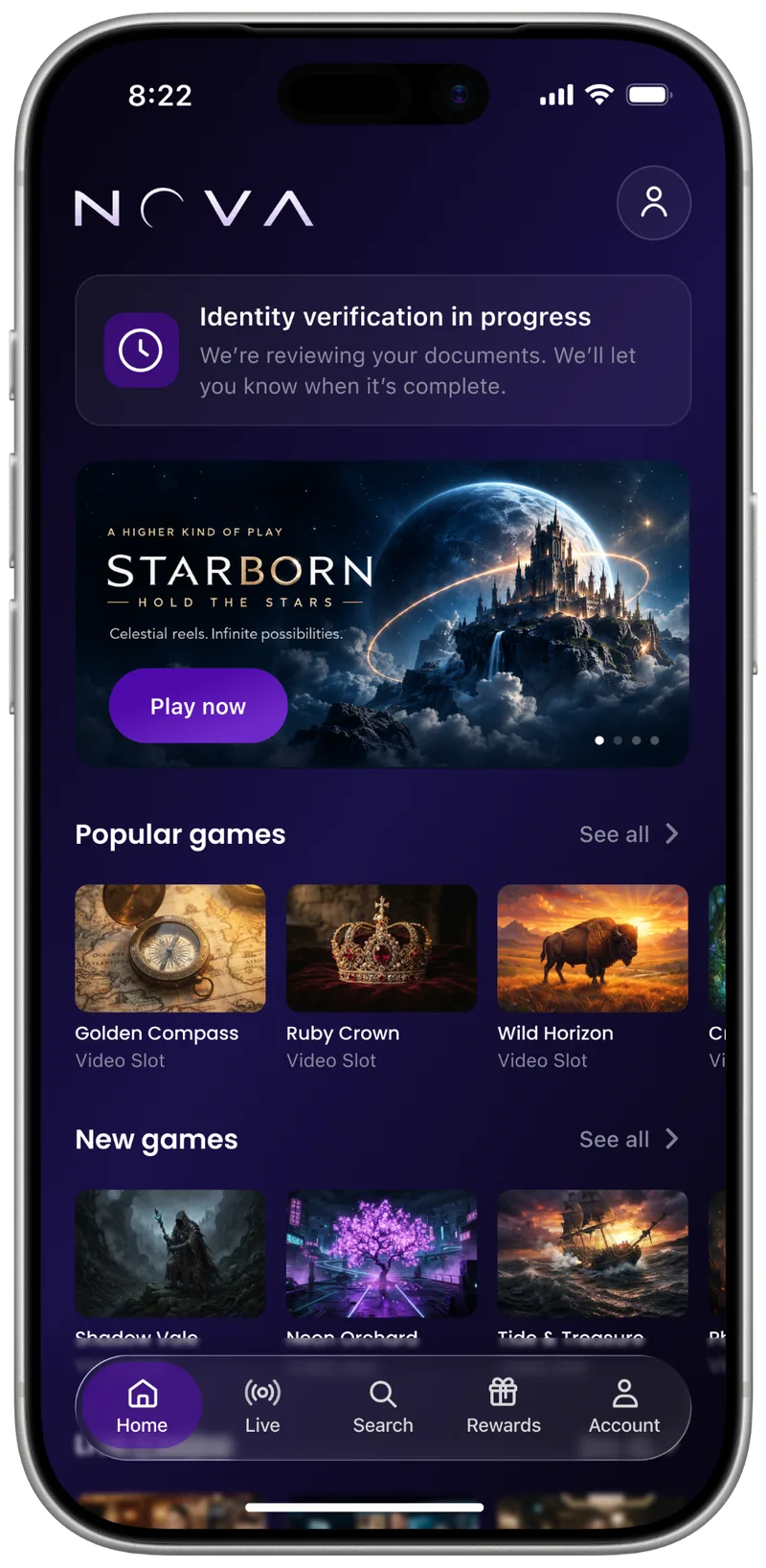
Leaving and coming back
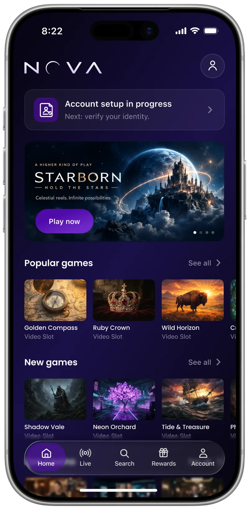
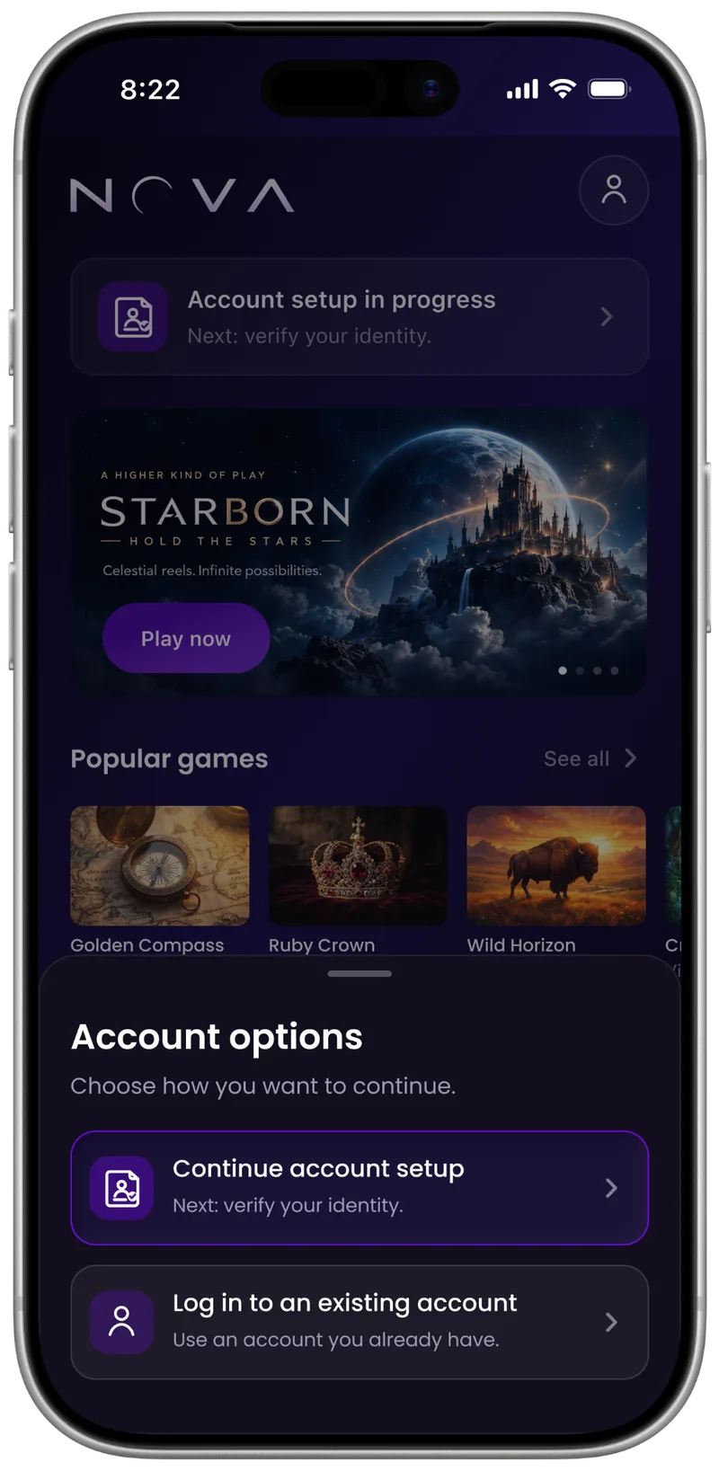
If a player leaves, Home shows their status and next step, so there’s no need to start over.
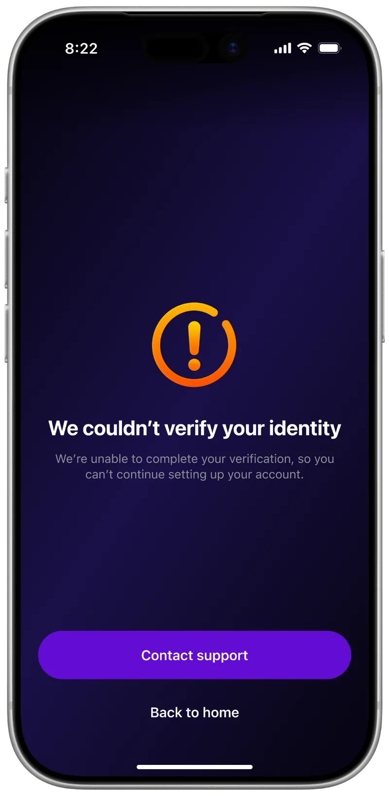
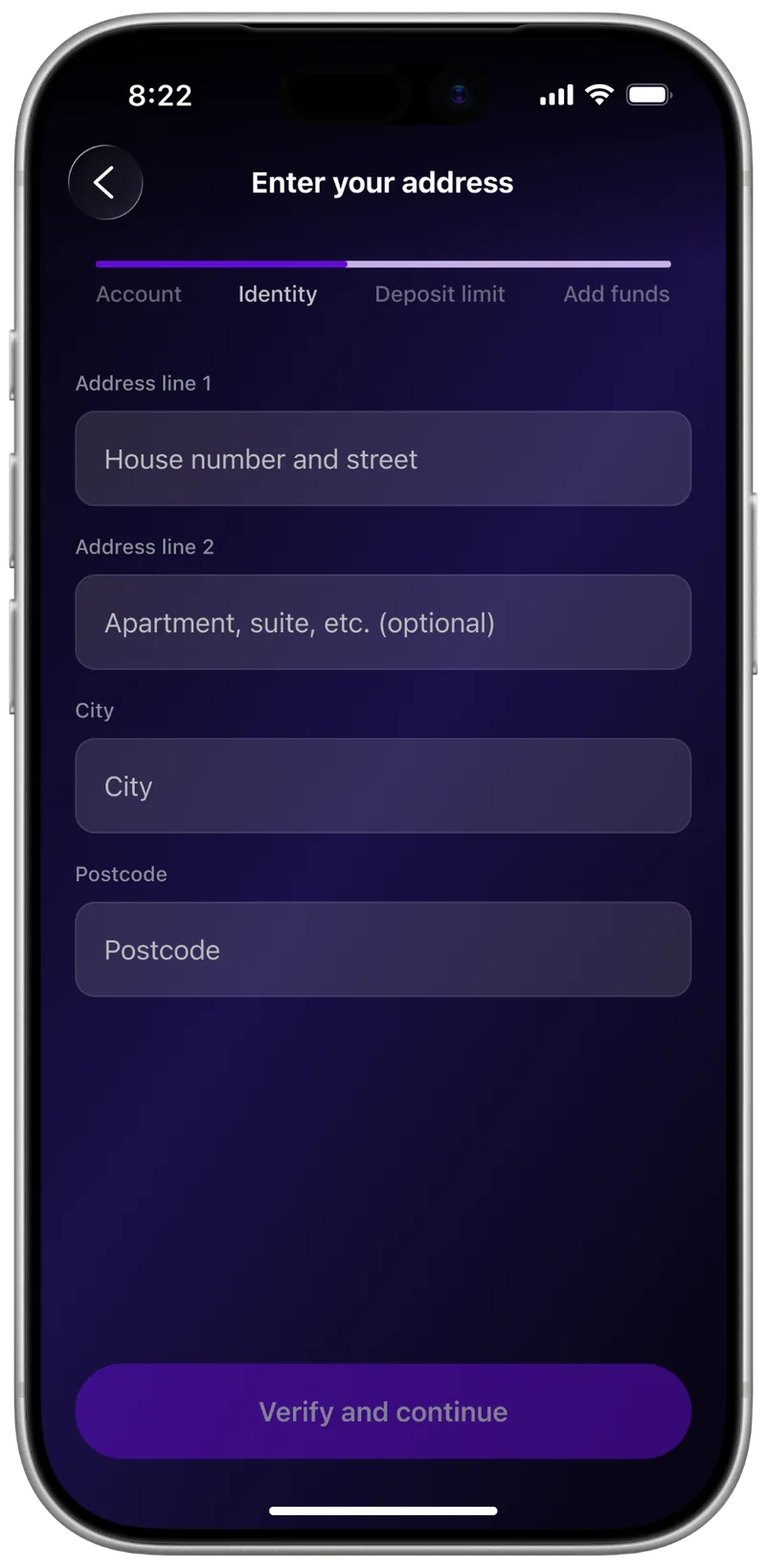
When verification doesn’t go smoothly
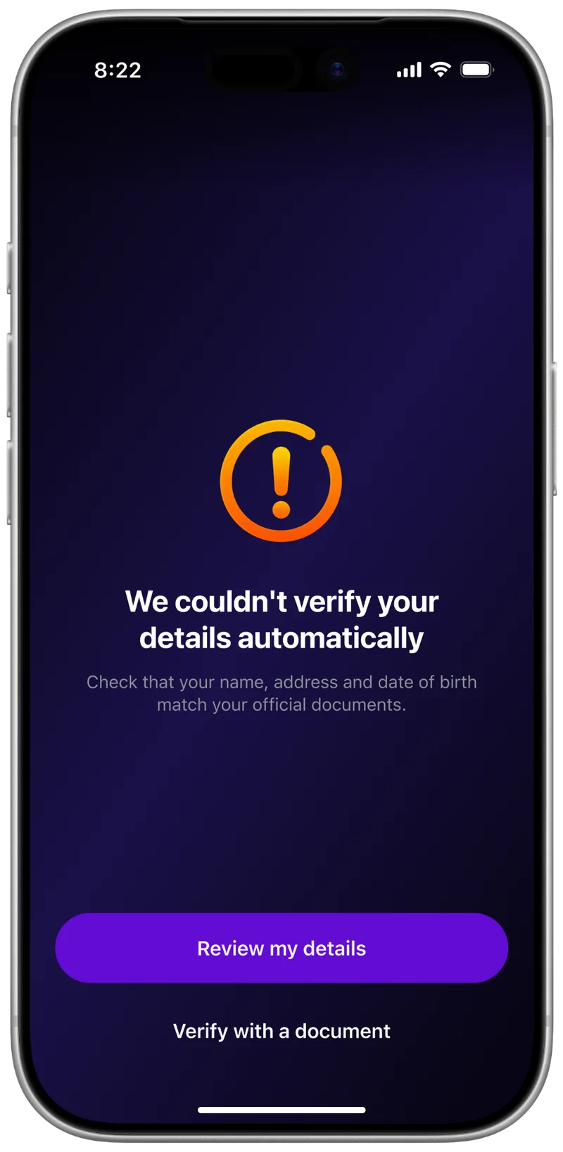
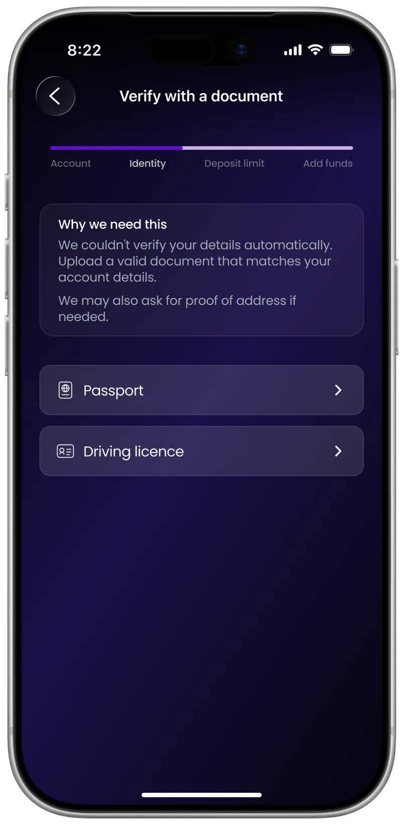
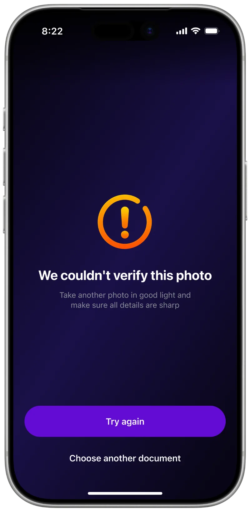
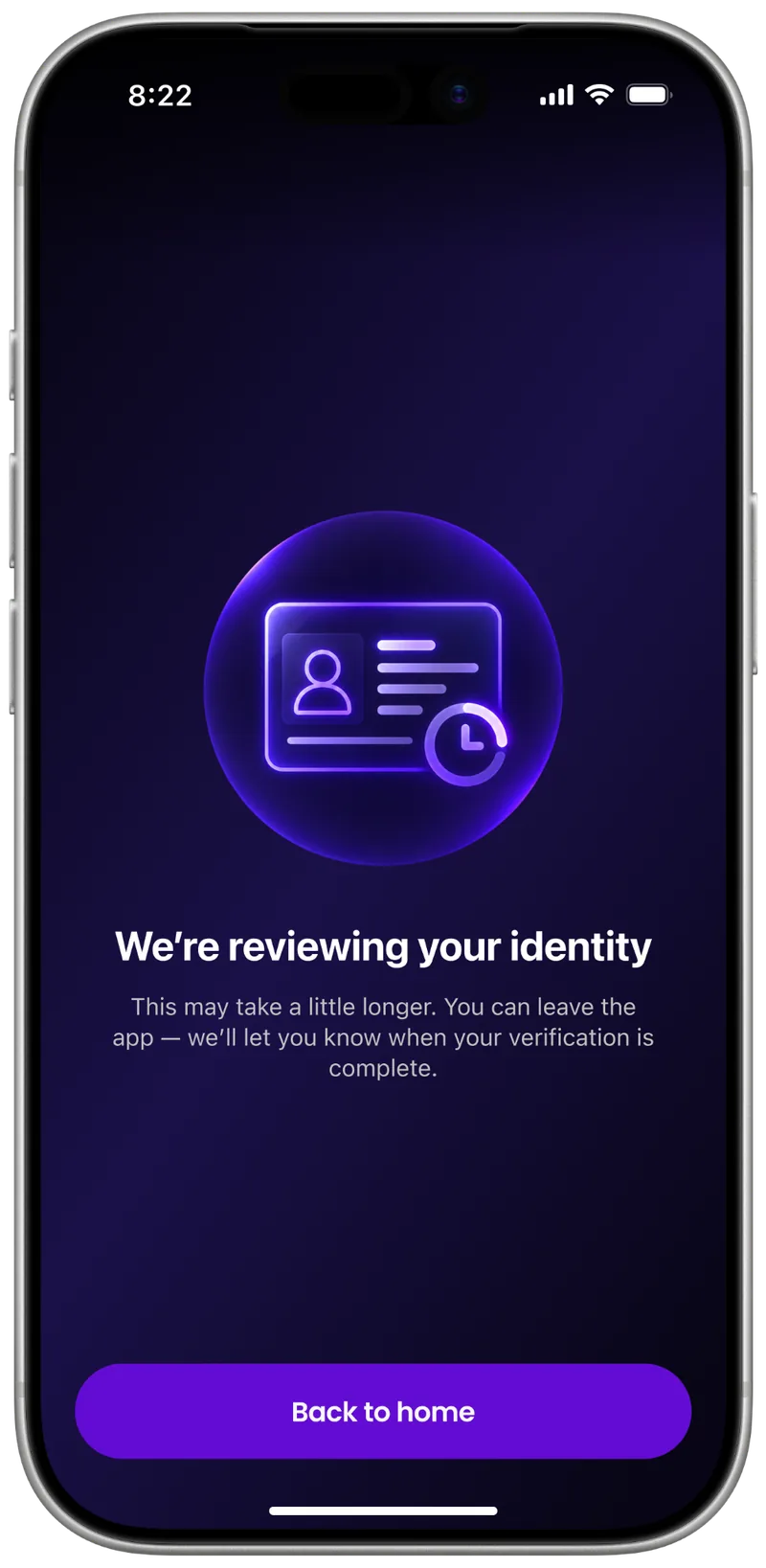
Every failed check has its own path, and each screen answers: what happened, what to do and what comes next.
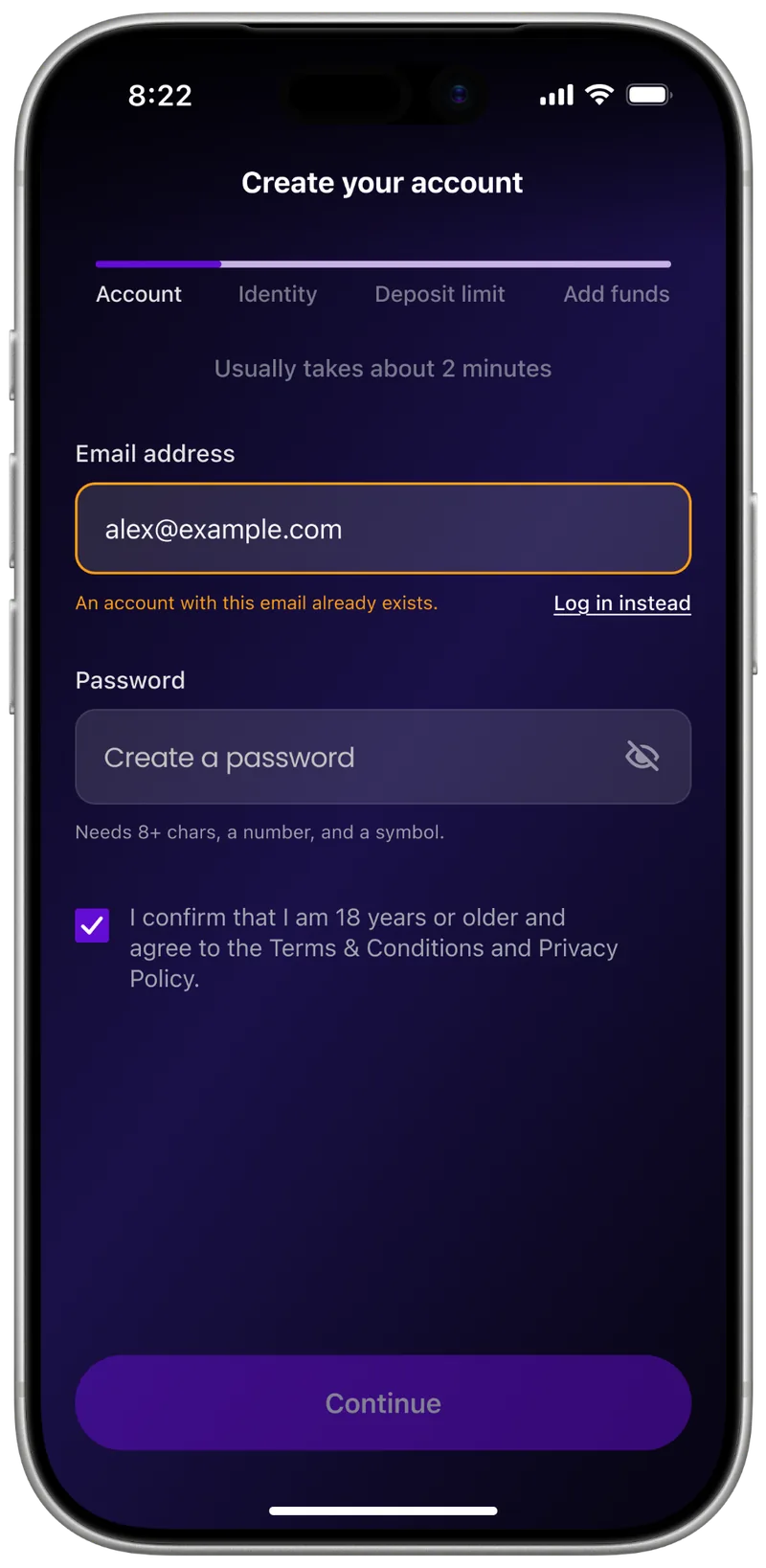
Recovering from form errors
If the email is already registered, we offer to log in. If the details are invalid, Continue stays disabled until they’re fixed.
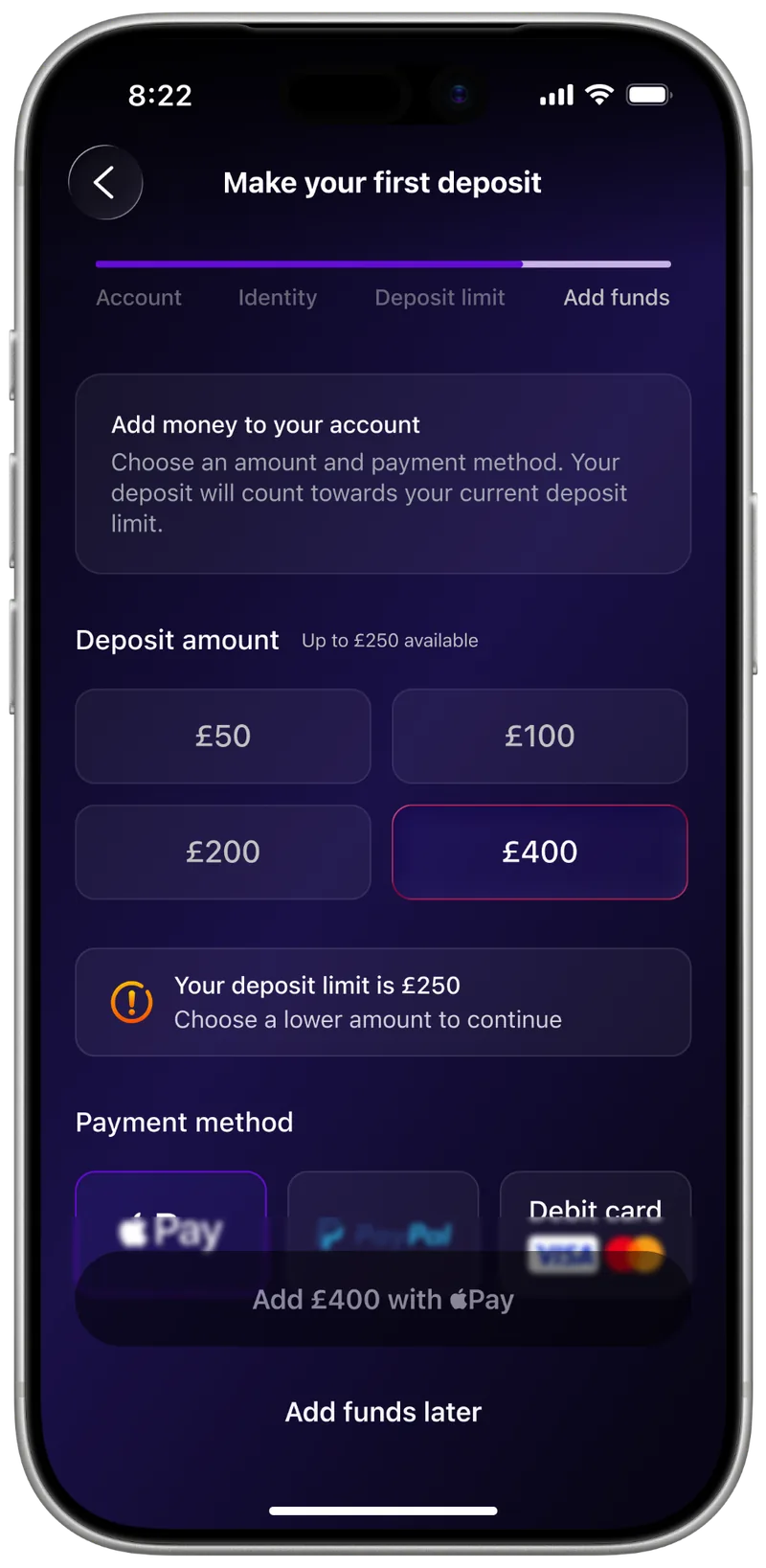
Funding without pressure
Limit and payment errors appear next to the choice that caused them.
Result
Instead of a stack of separate screens, one connected activation journey. It was handed off to development; product metrics are under NDA.
- 6 steps from the chosen game to launch.
- 11 edge cases, each with its own way out: 6 in identity checks, 2 in forms, 2 at payment, plus returning to an interrupted session.
What I learned
Good onboarding is tested not on the happy path but where things go wrong. Once I designed for errors and waiting, the main flow changed too.